| Author | Thread |
|
|
11/12/2006 08:33:54 AM |
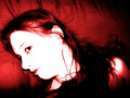
| I gave this a pretty high score. I think it says a lot about you, without revealing all. |
|
 Photographer found comment helpful. Photographer found comment helpful. |
Comments Made During the Challenge  |
|
|
11/11/2006 06:46:58 PM |
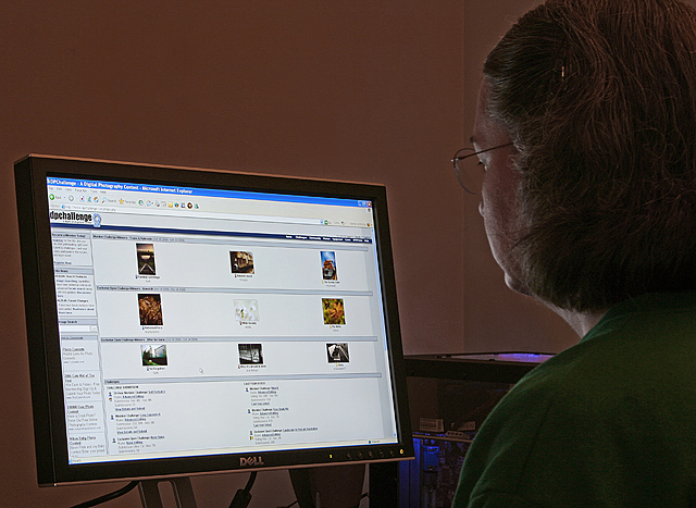
| I like the concept as a whole but don't feel that there is enough of "you" in the shot. Good job with making a monitor look good in a photo though! |
|
| Photographer found comment helpful. |
|
|
11/11/2006 09:21:38 AM |
not addicted not addicted not addicted not addicted not addicted not addicted not addicted not addicted
(that's what I keep telling myself :P) nice compo, might work in b/w too. |
|
| Photographer found comment helpful. |
|
|
11/08/2006 09:04:51 AM |
| In my opinion, I like the concept, but I think that there should be more light on yourself, as I feel like my eye stays on your computer screen, instead of going to you, when that is what my focus should be on (since the competition is a self portrait). Other than the lighting, good photo! |
|
| Photographer found comment helpful. |
|
|
11/07/2006 02:40:37 PM |
| Wish I could see more of the face. |
|
| Photographer found comment helpful. |
|
|
11/06/2006 07:10:28 AM |
| Good rapport. I love DPC too, but rather see a litle bit more of you and less of the monitor... |
|
| Photographer found comment helpful. |
|
|
11/06/2006 04:40:46 AM |
The dark room with a person staring at the monitor is unfortunately very overdone. To achieve an impact, the image should be very unique, with a quality of light and shadow that add extreme interest. This image comes off like a 2 minute setup, with not much thought to the overall exposure or subject matter.
Focus is great and the screen exposure is good, but the real subject is lost to the darkness.
While it meets the challenge, the image is not interesting. Question: would you print this and place it in a photo album?
Score: 2 |
|
| Photographer found comment helpful. |
|
|
11/05/2006 03:20:13 PM |
| Too much screen, not enough you |
|
| Photographer found comment helpful. |
|
|
11/05/2006 11:09:04 AM |
| Hey, this is such a familiar scene. |
|
| Photographer found comment helpful. |
|
|
11/05/2006 03:20:31 AM |
| Very appropriate! I love the clearcase on the 'puter, by the way. Nice minimalistic approach to the theme and good use of the light of the monitor! |
|
| Photographer found comment helpful. |
|
|
11/04/2006 10:52:03 PM |
I love the image on the screen, especially the pic on the middle-left. :-)
Seriously though, this would of worked a lot better had the room been completely dark, kept the same exposure you have on the screen (which is bang on) and let the light from the screen highlight the edge of your face.. would of worked better for me.. nice attempt though.. |
|
| Photographer found comment helpful. |
|
|
11/04/2006 08:16:06 PM |
|
| Photographer found comment helpful. |
Home -
Challenges -
Community -
League -
Photos -
Cameras -
Lenses -
Learn -
Help -
Terms of Use -
Privacy -
Top ^
DPChallenge, and website content and design, Copyright © 2001-2025 Challenging Technologies, LLC.
All digital photo copyrights belong to the photographers and may not be used without permission.
Current Server Time: 04/07/2025 09:08:24 PM EDT.