| Author | Thread |
|
|
10/21/2003 08:20:29 PM |
| Always the artists eye you have....nice |
|
Comments Made During the Challenge  |
|
|
10/21/2003 11:16:14 AM |
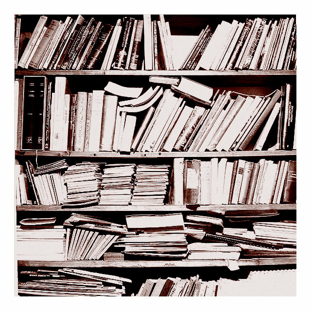
| I like the exposure value, but I think it would be better with only the top 3 bookshelves. |
|
 Photographer found comment helpful. Photographer found comment helpful. |
|
|
10/20/2003 02:23:30 PM |
| I like how the color is. It gives it that old-timey look, along with the messy book shelf. |
|
| Photographer found comment helpful. |
|
|
10/20/2003 10:01:18 AM |
| haha every scientist's office looks like that. oh i could swear that looks like my advisor's office. |
|
| Photographer found comment helpful. |
|
|
10/19/2003 05:00:53 PM |
| The thick border somehow works witht his shot. 7 |
|
| Photographer found comment helpful. |
|
|
10/19/2003 11:32:33 AM |
| I like your idea here, however it seems a touch over-exposed. |
|
| Photographer found comment helpful. |
|
|
10/18/2003 10:42:21 AM |
| picture seems a little too busy. There isn't really anything to grab attention. |
|
| Photographer found comment helpful. |
|
|
10/17/2003 02:44:25 PM |
| Interesting photo - I think the sharpness or contrast is a bit too high, the colors are great and composition as well. 8 |
|
| Photographer found comment helpful. |
|
|
10/16/2003 12:24:27 PM |
| Nice. I think I would have trimmed this down to the first three shelves, 4 & 5 seem a little too disorganized for me. Good idea. |
|
| Photographer found comment helpful. |
|
|
10/16/2003 04:37:03 AM |
| good idea but the harsh lighting overexposes the spines and pages of most of the books. |
|
| Photographer found comment helpful. |
|
|
10/15/2003 07:21:02 PM |
| Love the metallic tone of this photo. 8 |
|
| Photographer found comment helpful. |
|
|
10/15/2003 06:48:53 PM |
| Good idea. This could have scored higher if it wasn't soooo overexposed. The wide white frame seems to make things even worse. A plain B&W picture would have been better. |
|
| Photographer found comment helpful. |
|
|
10/15/2003 06:21:04 PM |
| Looks like my husbands den! LOL Neat shot but a little oof to my eye. I do like the tones, just a might bright here and there. |
|
| Photographer found comment helpful. |
|
|
10/15/2003 04:46:35 PM |
| Nice grainy overexposure. Love the contrast. I would buy a large poster sized print of this- that may be my only criticism- its poster-themed with out a focus- but hell- its better than my stuff! good job! |
|
| Photographer found comment helpful. |
|
|
10/15/2003 03:11:55 AM |
| Great picture! I love the duetones |
|
| Photographer found comment helpful. |
|
|
10/15/2003 02:26:35 AM |
| Sepia works fine, but i'm not sure with the overburning. |
|
| Photographer found comment helpful. |
|
|
10/14/2003 11:50:20 PM |
| I love this! The brightness..contrast..sharpness..wow. 10 |
|
| Photographer found comment helpful. |
|
|
10/14/2003 08:16:50 PM |
| the contrasts really make this photo |
|
| Photographer found comment helpful. |
Home -
Challenges -
Community -
League -
Photos -
Cameras -
Lenses -
Learn -
Help -
Terms of Use -
Privacy -
Top ^
DPChallenge, and website content and design, Copyright © 2001-2025 Challenging Technologies, LLC.
All digital photo copyrights belong to the photographers and may not be used without permission.
Current Server Time: 04/07/2025 12:54:34 PM EDT.