| Author | Thread |
Comments Made During the Challenge  |
|
|
08/11/2002 06:10:00 PM |
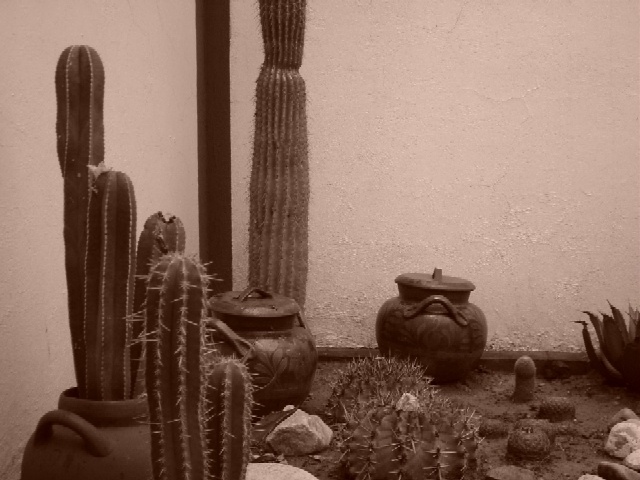
| I'd like to see this lightened up a bit and more contrast added. If you backed up a little or zoomed out to include the top of the cactus in the back I'd like it better. The background is nice, and the potential is there. I like the pots being included...nice touch! |
|
|
|
08/11/2002 07:02:00 AM |
| not enough contrast/ light is very dimm/dull. composition strange? what's the story? |
|
|
|
08/10/2002 12:14:00 PM |
| Black streak on wall is distracting ... If that's a shadow where are the other shadows... Would have liked a little more DOF .. I think this would have been better in color ... RLS |
|
|
|
08/09/2002 05:59:00 PM |
| For me this doesn't fit the theme. I am sure there is a link for you and for other viewers too perhaps, just not for me. Sorry. |
|
|
|
08/08/2002 01:52:00 PM |
| I don't think the use of sepia here helps very much.. |
|
|
|
08/08/2002 09:59:00 AM |
| a stonger side light might've helped spiff up this textural still life |
|
|
|
08/07/2002 03:54:00 PM |
| It is a nice composition, but I think it would work better to have a vertical framing, and just include the cacti and pots in the left corner. karmat |
|
|
|
08/07/2002 02:17:00 PM |
| Nice cactus garden? Was the point of the sepia to make this look older? The pots look good (kinda new). Not really thrilled with the composition either, its weighted too heavily on the left and bottom. 6 Swash |
|
|
|
08/05/2002 06:26:00 PM |
| Your sepia tone is a little too red in my opinion. And this looks like a modern setting anyway. The idea is fine but I think you needed to find a better location to shoot it. |
|
|
|
08/05/2002 05:41:00 PM |
| I don't think sepia adds anything in the way of age to this photo. Maybe a vertical orientation would have helped as well. |
|
|
|
08/05/2002 10:01:00 AM |
| For me sepia dosen't work here,its too heavy handed. |
|
|
|
08/05/2002 01:19:00 AM |
| I think this particular image may be too complex for me to understand as an entry in the 'something old' challenge... - jmsetzler |
|
Home -
Challenges -
Community -
League -
Photos -
Cameras -
Lenses -
Learn -
Help -
Terms of Use -
Privacy -
Top ^
DPChallenge, and website content and design, Copyright © 2001-2026 Challenging Technologies, LLC.
All digital photo copyrights belong to the photographers and may not be used without permission.
Current Server Time: 02/01/2026 06:31:44 AM EST.