| Author | Thread |
Comments Made During the Challenge  |
|
|
08/09/2002 12:12:00 PM |
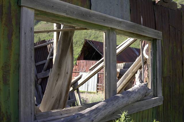
| Good subject choice. VERY difficult to get a DOF large enough to encompass the window and the things through. Good effort. |
|
|
|
08/08/2002 10:43:00 PM |
| This is good...but I think it would have been more effective in black and white. Nice thinking though! |
|
|
|
08/08/2002 05:41:00 AM |
| The picture looks unbalanced because you have cropped more off the bottom of the frame than the top. You should also bash the weeds back so they dont intrude into the picture. |
|
|
|
08/07/2002 04:31:00 PM |
| I really like this one allot it feels kind of complicated but you can tell that everything was just kind of thrown around and has sat there for years. |
|
|
|
08/07/2002 03:46:00 PM |
| I like how you have used the lighting and focus here. Good job, and neat idea. karmat |
|
|
|
08/07/2002 12:42:00 AM |
| Great shot..well alanced and good depth. |
|
|
|
08/06/2002 06:26:00 PM |
| interesting composition :) I can't really come up with a good critique on this one. :) - jmsetzler |
|
|
|
08/06/2002 01:03:00 PM |
I very much like this photo. The angle and composition/cropping really make this very effective. The colors and lighting also work very well. Really nice work! 9
Ruthann |
|
|
|
08/06/2002 10:59:00 AM |
| The window and barn do a good job of pulling me into the photo but the supporting wall in the foregound is somewhat distracting and pulls my attention off to the borders of the frame. The muted colors help emphasize the age of the wooden objects. Might be interesting to see what it would look like with more of the 'through the window' area filling the frame and less of the supporting wall. |
|
|
|
08/05/2002 06:18:00 PM |
| B & W would have made it get another point. |
|
|
|
08/05/2002 02:44:00 PM |
| this is my personal favorite |
|
|
|
08/05/2002 01:27:00 PM |
| clever title and interesting perspective. I wish it were cleaner on the other side of the window so I saw only the barn and not the distracting junk from the past. |
|
|
|
08/05/2002 12:11:00 PM |
| Great exposure of a very hard to expose shot!!!Nothing blown out or underexposed.The colors are slightly muted though. |
|
|
|
08/05/2002 11:48:00 AM |
| interesting vantage point...i like it. 7 Lisa |
|
|
|
08/05/2002 05:46:00 AM |
| I would of cropped the foreground weeds out, but that is just my opinion! 7 |
|
|
|
08/05/2002 03:00:00 AM |
| Composition, color, theme--it's all there. |
|
|
|
08/05/2002 01:58:00 AM |
| Oh, I love this picture. It is very interesting and enjoyable to look at. Love the subdued colors yet is lively. Only nitpick: the two small shapes at top right corner. |
|
Home -
Challenges -
Community -
League -
Photos -
Cameras -
Lenses -
Learn -
Help -
Terms of Use -
Privacy -
Top ^
DPChallenge, and website content and design, Copyright © 2001-2026 Challenging Technologies, LLC.
All digital photo copyrights belong to the photographers and may not be used without permission.
Current Server Time: 02/01/2026 11:50:27 AM EST.