| Author | Thread |
Comments Made During the Challenge  |
|
|
10/18/2003 07:49:01 PM |
| This makes a really nice photo. Composition works for me, and shadow makes it more interesting. Great shot. |
|
 Photographer found comment helpful. Photographer found comment helpful. |
|
|
10/18/2003 07:02:57 PM |
| I think the lighting is too strong on the right side... it might have been better to pull it up a bit - the shadow on the inside of that acorn casing is a bit much also. I like your composition and placement in the frame. |
|
| Photographer found comment helpful. |
|
|
10/16/2003 12:24:29 PM |
| The grain of the paper is distracting. IMOP a smooth background would have worked better, possibly a different color. |
|
| Photographer found comment helpful. |
|
|
10/15/2003 10:44:16 AM |
| I think this shot would have been better with different lighting, and getting rid of the shadows. |
|
| Photographer found comment helpful. |
|
|
10/14/2003 07:21:31 PM |
| While I like the subject matter there are too many shadow areas from your lighting situation. |
|
| Photographer found comment helpful. |
|
|
10/14/2003 06:48:11 PM |
| I think if you used a white card on the left side of the shot the shadows wouldnt be so harsh and distract from the main subject. |
|
| Photographer found comment helpful. |
|
|
10/13/2003 09:38:38 PM |
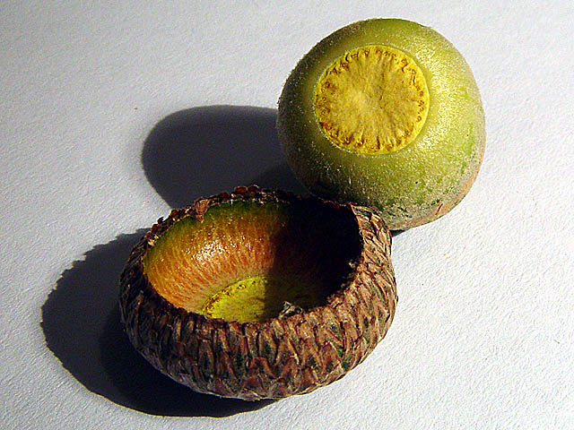
Nice and crisp and good DOF.
Would like to see more of the inside of the exposed Cap. |
|
| Photographer found comment helpful. |
|
|
10/13/2003 09:06:45 PM |
| the acorn cap is particularly nice |
|
| Photographer found comment helpful. |
|
|
10/13/2003 04:13:14 PM |
Nicely done and idea well met.
Only real "crticism" is tha the lighting is a bit on the harsh side. But exposure and composition very good. |
|
| Photographer found comment helpful. |
|
|
10/13/2003 02:24:13 PM |
| Nice composition, nice clear focus, a bit oversharpened and the lighting seems too harsh. |
|
| Photographer found comment helpful. |
|
|
10/13/2003 02:01:12 PM |
| Lighting is a bit harsh. Maybe I would have liked better a black background. |
|
| Photographer found comment helpful. |
|
|
10/13/2003 01:39:24 PM |
| Nice work. I like the shadow but realize many will not. I think the light is harsh, and bit over sharpened. Still very good entry. |
|
| Photographer found comment helpful. |
|
|
10/13/2003 09:46:26 AM |
| Very nice shot. :-) Maybe a bit much of shadows, but I like it. |
|
| Photographer found comment helpful. |
|
|
10/13/2003 08:01:13 AM |
| Great macro shot. Make a good still life. Nice lighting and composition. Maybe a little too much sharpening in photoshop. Great job. 8. |
|
| Photographer found comment helpful. |
|
|
10/13/2003 03:54:46 AM |
Good points:Good textures
Bad Points:don't like the floor material, better pure white
Score:4 |
|
| Photographer found comment helpful. |
|
|
10/13/2003 02:58:44 AM |
| Simple composition, very clean. I like the no frills look, they both have a good focus, the colors are natural and the lighting works well. Would've liked to see the entire inside of the acorn cap, just to extend that 'exposed' feeling. Great work! 7 |
|
|
|
10/13/2003 12:47:21 AM |
| My kids love taking the tops off the acorns and then gluing them back on, LOL, go figure! Great idea, the shadow on the top is wonderful, it draws you into the picture. It does seem just a bit oversharp to me, starting with an 8, will be back to look again. |
|
| Photographer found comment helpful. |
|
|
10/13/2003 12:08:22 AM |
| Good job using lighting to create some extra effect on this macro. The detail here is excellent. When working with macros, you have to pay extra close attention to the finer detail like that small spot just off the left edge of the top shadow. It's a minor thing but it shows up with more strength in a closeup photo. |
|
| Photographer found comment helpful. |
Home -
Challenges -
Community -
League -
Photos -
Cameras -
Lenses -
Learn -
Help -
Terms of Use -
Privacy -
Top ^
DPChallenge, and website content and design, Copyright © 2001-2026 Challenging Technologies, LLC.
All digital photo copyrights belong to the photographers and may not be used without permission.
Current Server Time: 02/01/2026 08:13:37 AM EST.