| Author | Thread |
|
|
10/22/2003 11:17:41 PM |
CRITIQUE CLUB CRITIQUE
karmat
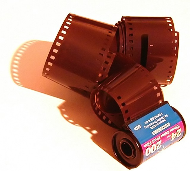
Compositionally, I like the simplicity of this shot. It feels "anchored" in the lower right corner and then "flows" up and to the left, which gives it a balance and natural feeling to it (at least to me). I think the idea itself was quite creative (even if there were a couple more of them -- just means some of you are creative in teh same way!), and I had not even thought of it. Guess I've been shooting digital way too long! :-)
The overexposure you mention, doesn't bother me to badly. In one sense it makes the image stand out, and provides a stark contrast to the film and canister I do think a sharper focus on the canister would have helped you tremendously. I have found that especially on dpc, if words are in your picture, they need to be razor sharp, because it is so noticeable if they aren't.
Again, neat idea, and best to you in future challenges.
karmat |
|
 Photographer found comment helpful. Photographer found comment helpful. |
Comments Made During the Challenge  |
|
|
10/17/2003 01:32:28 AM |
| Nicely done. Love the shadow. |
|
| Photographer found comment helpful. |
|
|
10/16/2003 07:06:23 PM |
As you have probably seen by now there is at least one other with the same idea but different execution.
With yours I can not see any specific point of sharp focus perhaps due to "soft" sharpening in camera that therefore could benefit form some PP |
|
| Photographer found comment helpful. |
|
|
10/14/2003 12:06:08 PM |
| This is an interesting composition, but the lighting is a bit too harsh for my taste. The image also seems to be a bit soft overall. |
|
| Photographer found comment helpful. |
|
|
10/13/2003 04:12:52 PM |
| Ah, the second 35mm film shot I've seen in this challenge. I don't know if you've see the other one but I like the concept of this, especially considering the site it's on. The clarity of the shot is wanting a bit and the film cannister is just enough out of focus to be distracting. A black background would have worked a bit better to me but then you wouldn't have gotten the shadows, maybe a yellow one, something a little bit less harsh though judging from your title that is what you might have been going for. I'm starting this one at a 6 but will be back to look at it again. |
|
| Photographer found comment helpful. |
|
|
10/13/2003 01:55:26 PM |
| Like the shadow, the composition and the colors. The roll is not in focus and that is a drawback. It does fit the challenge nicely. |
|
| Photographer found comment helpful. |
|
|
10/13/2003 09:34:29 AM |
| This shot would have been also very attracting to the Irony challenge as well. I love this picture, technically I would have left equal space from the border in every direction. |
|
| Photographer found comment helpful. |
|
|
10/13/2003 07:04:18 AM |
Good points: Nice if cheesy idea, well framed and well composed
Bad Points:quality is low, look at the film text
Score:5 |
|
| Photographer found comment helpful. |
|
|
10/13/2003 12:25:32 AM |
| nice composition and good idea, but the printing on the film roll is not very sharp. |
|
| Photographer found comment helpful. |
Home -
Challenges -
Community -
League -
Photos -
Cameras -
Lenses -
Learn -
Help -
Terms of Use -
Privacy -
Top ^
DPChallenge, and website content and design, Copyright © 2001-2026 Challenging Technologies, LLC.
All digital photo copyrights belong to the photographers and may not be used without permission.
Current Server Time: 02/01/2026 08:42:41 AM EST.