| Author | Thread |
|
|
10/21/2003 07:28:02 AM |
"Critique Club"
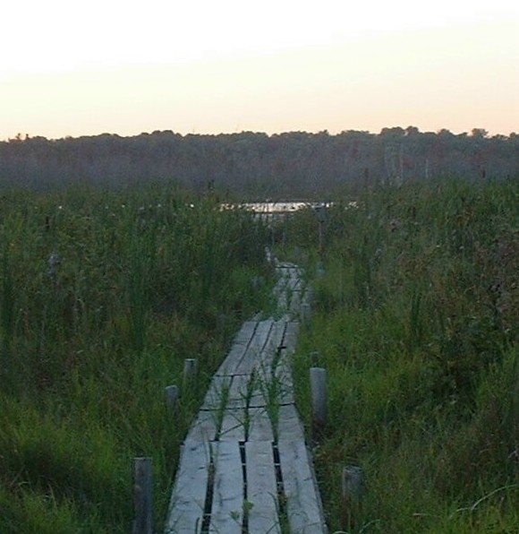
Not sure where to start with this other than I understand why you scored so low on this. For starters this was URBAN landscape and the discription of the challenge said it should have buildings in it. I don't see any buildings at all in your photo.
Now you do have an interesting subbject with that wooden walkway. You should try shooting it so that the walk starts at one corner of your photo and goes part way across you photo leaving the lake near the opposite side of the photo.
This could be a lot stronger as it is if it was a little brighter and you either use a haze filter or you play a little with the contrast and saturation to get rid of the gray hazy. |
|
Comments Made During the Challenge  |
|
|
10/14/2003 03:02:51 AM |
| Not a realy bad shot, buy not very urban to me... |
|
|
|
10/13/2003 06:25:44 PM |
|
|
|
10/13/2003 02:06:00 PM |
base 1: 1/1; challenge: 0/3; technical: 2/3; aesthetics: 0/3; total: 3
Nothing Urban or even buildings here. Focus too soft, color levels could use adjustment to make it more dynamic and less flat. Sky is blown out/white. In another "open spaces" type challenge, this photo might do better. Nice idea for such an 'open spaces' type shot, but execution could use some work. |
|
|
|
10/13/2003 01:21:14 PM |
Details: Shoot anything with buildings - from cities to villages.
|
|
|
|
10/13/2003 12:23:12 AM |
| Rural urban, very well done. Just a bit too fuzzy and the colors could be punched up just a bit. |
|
|
|
10/09/2003 09:32:01 PM |
| the colours are unsaturated and details from this photo seem poor. Fits the challenge in my opinion (the walk planks are signs of urbanization to me). The bright sky is uninspiring (no details at all). I rate this a 6 |
|
|
|
10/09/2003 09:31:32 PM |
| It's not so much that it doesn't fit the challenge. It's the lack of focus, the composition, and lack of details. I feel I would be insulting you if I offered any suggestions about how you could improve this. Good luck. |
|
|
|
10/09/2003 12:16:10 PM |
|
|
|
10/09/2003 12:15:53 PM |
| I don't see the buildings.... For this picture the rule of thirds with the walkway might help |
|
|
|
10/08/2003 02:42:29 PM |
|
|
|
10/08/2003 11:42:36 AM |
| I would have liked this better if the walk way was off center and going at an angle going towards the lake. |
|
|
|
10/08/2003 11:04:21 AM |
| Hmm. Not seeing a building here. Foreground looks a little out of focus. |
|
|
|
10/08/2003 09:34:26 AM |
| This isn't an urban landscape. |
|
|
|
10/08/2003 02:36:36 AM |
| What is Urban about this and where is the building? |
|
|
|
10/08/2003 01:11:58 AM |
|
|
|
10/08/2003 12:49:42 AM |
| a bit hazy and unclear, can't really see the lake that good. |
|
Home -
Challenges -
Community -
League -
Photos -
Cameras -
Lenses -
Learn -
Help -
Terms of Use -
Privacy -
Top ^
DPChallenge, and website content and design, Copyright © 2001-2026 Challenging Technologies, LLC.
All digital photo copyrights belong to the photographers and may not be used without permission.
Current Server Time: 02/01/2026 08:28:47 AM EST.