| Author | Thread |
|
|
06/11/2014 09:08:13 AM |
| A very interesting take on how the angle of light creates the shadows. |
|
|
|
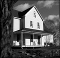
02/26/2007 04:07:21 AM |
| I bet this one would be nice rendered in b/w. As it is, it is a very informative and entertaining image. Americana in a way. |
|
Comments Made During the Challenge  |
|
|
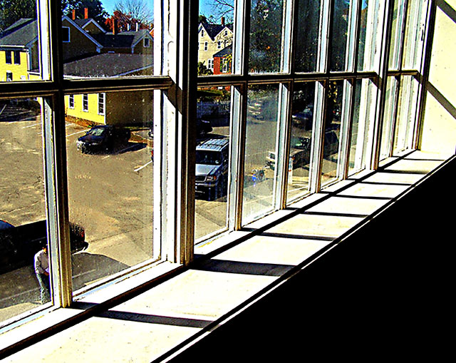
10/24/2006 11:45:53 AM |
| I like the rhythm of the panes here, and there is a funky appeal to the composition that I kind of like. The light is clearly strong, but the mullions break up the photo so much that one has the sense that it would be essentially the same photo in any light. the photo appears to be highly over-saturated: It produces an attractive glow in the yellow house and the distant brick chimneys, but the strong blue cast in the trim tattles on you. I wish the guy in the bottom left corner were gone. |
|
 Photographer found comment helpful. Photographer found comment helpful. |
|
|
10/24/2006 08:58:53 AM |
| I love that 1960s postcard world outside the window. 8 |
|
| Photographer found comment helpful. |
|
|
10/20/2006 01:31:13 AM |
| It does meet the challenge but i doesnt see here any artistic aproach. |
|
| Photographer found comment helpful. |
|
|
10/19/2006 05:49:58 PM |
|
| Photographer found comment helpful. |
|
|
10/18/2006 06:54:32 AM |
| This is the DPC Police! Put down the sharpening and come out with your hands up! Just teasing... but definitely use less sharpening, and try playing with the settings -- if you're using Pshop, both the "amount" and "radius" are too much. Visit the tutorial section. |
|
| Photographer found comment helpful. |
Home -
Challenges -
Community -
League -
Photos -
Cameras -
Lenses -
Learn -
Help -
Terms of Use -
Privacy -
Top ^
DPChallenge, and website content and design, Copyright © 2001-2025 Challenging Technologies, LLC.
All digital photo copyrights belong to the photographers and may not be used without permission.
Current Server Time: 04/07/2025 02:26:41 PM EDT.