| Author | Thread |
|
|
10/26/2006 06:19:26 PM |
*Critique Club*
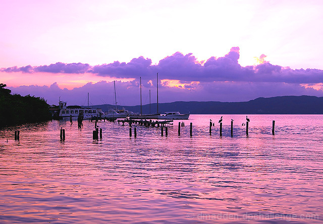
While this is a nice shot overall, I think you could have achieved your goal of emphasizing the gulls and boats a bit better by cropping out some of the bottom. The patterns in the water are nice but they really do not add a whole lot to the main point of the photo. Personally, I would have cropped so that the horizon line was in the exact center of the shot. (However, I think this idea may not have done so well with the voters!!)
I like the contrast here. The color is nice, but it does feel a little too fake or processed to me. I would have liked to see some of the oranges brought out a little more, if possible.
The other thing I want to mention is: Your horizon is obviously straight, but the way the clouds are just gives a bit of a tilting feel to the photo. But this is a very minor point, and doesn't affect my initial impression of the shot.
I have probably sounded very critical but the main thing is that your image is very nice to look at and I am just nitpicking some things to hopefully be helpful. Congrats on a nice, peaceful, and beautiful shot. |
|
 Photographer found comment helpful. Photographer found comment helpful. |
Comments Made During the Challenge  |
|
|
10/22/2006 04:34:37 PM |
| Colors are awesome in this one. |
|
| Photographer found comment helpful. |
|
|
10/19/2006 11:02:07 PM |
|
| Photographer found comment helpful. |
|
|
10/19/2006 10:34:00 PM |
| Nice, lovely image. You might consider moving the horizon either up or down to a third to see if that might work well. Lovely colors and serene feel. |
|
| Photographer found comment helpful. |
|
|
10/19/2006 11:06:48 AM |
love the triangle of the trees on the left drawing my eye into the photo, and the further implied triangle of the pilings in the water.
The trees on the left are a little too dark, and tend to add weight to that side of the photo - but overall nice composition and beautiful colors. |
|
| Photographer found comment helpful. |
|
|
10/18/2006 11:08:28 AM |
| Lovely colours and an interesting subject. The pelicans add some nice interest. |
|
| Photographer found comment helpful. |
|
|
10/17/2006 03:10:58 PM |
| A bit too much pink in the picture for me. It takes over the whole phot and makes me think the color may have been off. Perhaps if the pink had been graduated over the water ending in a blue, it would have come off better. Not a bad photo by any means, just too pink for my taste. |
|
| Photographer found comment helpful. |
|
|
10/17/2006 01:46:23 AM |
Meets Challenge - 2
Lighting/Processing - 2
Composition - 1
Overall Impression - 2
"WOW" factor - 1
Score: 8 |
|
| Photographer found comment helpful. |
|
|
10/16/2006 12:48:40 PM |
| The lilac hue is outstanding and the pelicans a delicate and subtle effect. All in all, very nice. 8. |
|
| Photographer found comment helpful. |
|
|
10/16/2006 09:55:58 AM |
|
| Photographer found comment helpful. |
|
|
10/16/2006 02:43:41 AM |
| Interesting colours but lacks a "wow" to it |
|
| Photographer found comment helpful. |
|
|
10/16/2006 01:15:45 AM |
| Lovely purple... I can picture those gulls saying "Mine?" |
|
| Photographer found comment helpful. |
Home -
Challenges -
Community -
League -
Photos -
Cameras -
Lenses -
Learn -
Help -
Terms of Use -
Privacy -
Top ^
DPChallenge, and website content and design, Copyright © 2001-2026 Challenging Technologies, LLC.
All digital photo copyrights belong to the photographers and may not be used without permission.
Current Server Time: 02/01/2026 10:07:33 AM EST.