| Author | Thread |
Comments Made During the Challenge  |
|
|
10/13/2006 08:00:16 PM |
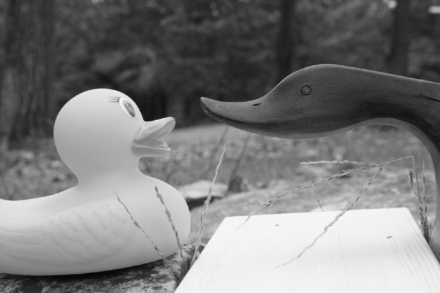
| I think I would have liked it better if just the ducks were desaturated. |
|
|
|
10/13/2006 04:12:21 PM |
| The lighting on this shot looks ok to me, but I find the board (?) between the two ducks to be fairly distracting. I might also suggest including the entire rubber duck in the frame of the shot, rather than the tail being cropped off. |
|
|
|
10/12/2006 08:47:23 PM |
| I can't see what the block of wood is for, it doesn't add anything to the image that's worthwhile. ;-) |
|
|
|
10/12/2006 06:41:25 PM |
| Ha Ha. Funny one. Good expressions on both of them, as well. |
|
|
|
10/11/2006 05:41:21 PM |
| i don't think that b/w had improved the image |
|
|
|
10/11/2006 04:05:00 PM |
| I am not sure B&W works for this. It appears dull. |
|
|
|
10/11/2006 01:51:05 PM |
| lighting is flat it needs a punch |
|
|
|
10/11/2006 10:07:04 AM |
| Your tones are a bit washed out. Level adjustment might of corrected this but the white board below them is pretty over exposed. Your props were good and the idea/title was good. |
|
|
|
10/11/2006 12:48:36 AM |
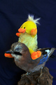
| Hmmm....another photo confused on whether it wants to be a rubber ducky or woody entry. |
|
Home -
Challenges -
Community -
League -
Photos -
Cameras -
Lenses -
Learn -
Help -
Terms of Use -
Privacy -
Top ^
DPChallenge, and website content and design, Copyright © 2001-2026 Challenging Technologies, LLC.
All digital photo copyrights belong to the photographers and may not be used without permission.
Current Server Time: 02/01/2026 07:35:30 AM EST.