| Author | Thread |
|
|
10/18/2006 08:48:54 AM |
| cute shot, nice composition. |
|
 Photographer found comment helpful. Photographer found comment helpful. |
Comments Made During the Challenge  |
|
|
10/14/2006 01:40:59 PM |
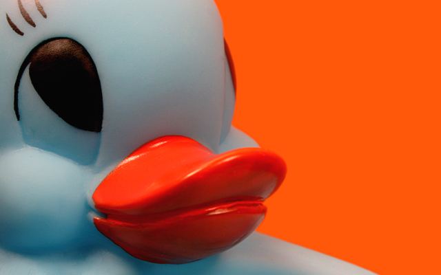
| The only issue I have is the choice of background,,,,this shot would have really popped with a better contrast in background and those red lips....IMHO. |
|
| Photographer found comment helpful. |
|
|
10/12/2006 09:49:55 AM |
Meets Challenge = 2
Technical Stuff = 2
Creativity = 2
Overall Impression = 1
Biased Wow Factor = 0
Super comp, but I'd prefer a different bg color. |
|
| Photographer found comment helpful. |
|
|
10/12/2006 08:20:25 AM |
| Like the background color and the closeup is just the right balance. Nicely done. |
|
| Photographer found comment helpful. |
|
|
10/12/2006 07:46:53 AM |
This is a very nice close-up of the Ducky - a portrait style photograph for a still life:-) Lighting and background settings are the two areas that this photograph needs improvment in. Lighting is the one of the single biggest challenges a photographer grapples with all the time. The lighting in this photo gives this ducky a blueish tinge to its white colored plastic body. That bluish cast dulls the normally vibrant white color of the duck. The color of the duck is dull and as such does not pop off the background visually. It might be because of what light source you used or a need to set the White Balance in your camera. Just one article on lighting that may help you is //www.ezine-articles-planet.com/Article/Digital-Photography--White-Balance-Demystified/27834
You could also look at some good tutorials here at DPC - one shows you step by step on how to compensate and remove color cast from your photograph //www.dpchallenge.com/tutorial.php?TUTORIAL_ID=24 . Lastly, the background you chose is a little too close in hue to the orange of the beak. The vibrancy of the color of orange is drawing the eye's attention away from the duck. Plus, it is not allowing the duck to visually pop off the background. Experimenting with other vibrant (or not as vibrant) hues that are NOT the same colors as your main subject will help your main focal point visually pop of the page - i.e. blue, yellow, red, etc.... Hope this critique helps. |
|
| Photographer found comment helpful. |
|
|
10/11/2006 06:02:06 AM |
| Yeah, pretty, just what I was thinking. It's really nice best of luck in the challenge. |
|
| Photographer found comment helpful. |
|
|
10/10/2006 08:42:09 PM |
| Pretty brave to use that background or was it post processed? Inquire minds want to know! |
|
| Photographer found comment helpful. |
Home -
Challenges -
Community -
League -
Photos -
Cameras -
Lenses -
Learn -
Help -
Terms of Use -
Privacy -
Top ^
DPChallenge, and website content and design, Copyright © 2001-2025 Challenging Technologies, LLC.
All digital photo copyrights belong to the photographers and may not be used without permission.
Current Server Time: 04/07/2025 02:05:25 AM EDT.