| Author | Thread |
Comments Made During the Challenge  |
|
|
10/10/2006 03:51:59 AM |
...oh my!
Looks like something I used to give my "friends" when I was 5 years old... |
|
|
|
10/06/2006 09:01:43 PM |
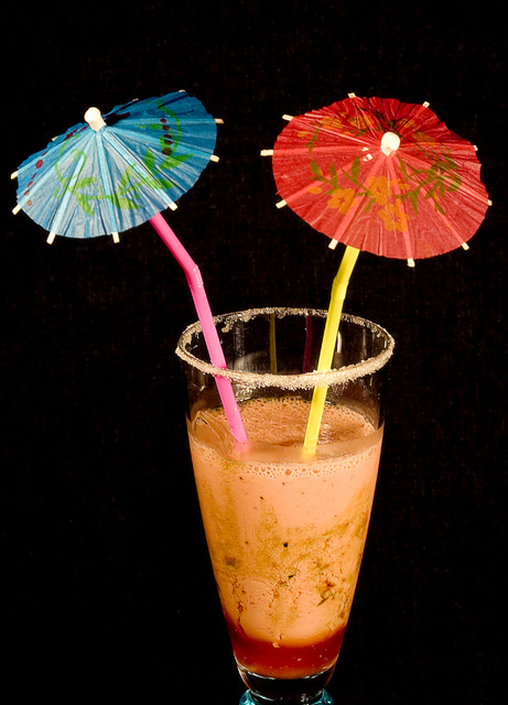
| I like the comp and lighting. Text would fit well in this. Umbrellas add a tropical feel but....The beverage doesn't look appetizing. Perhaps you could've blended it bit more. Great start. |
|
|
|
10/05/2006 10:31:17 PM |
| Very unappealling. Perhaps if the bottom of the glass wasn't cropped off and maybe the angle was lower? |
|
|
|
10/05/2006 09:42:09 PM |
| I am sorry but that drink looks really gross. That is not something I would want to drink, which makes that not a very effective ad. |
|
|
|
10/05/2006 10:46:26 AM |
| Yummy looking drink. What class of beer or soft drink is this anyway? :D |
|
|
|
10/04/2006 07:37:28 PM |
|
|
|
10/04/2006 09:42:10 AM |
| Bottom crop is a little tight making it feel crowded. You did well with the lighting. |
|
|
|
10/04/2006 09:19:52 AM |
| i wouldn't drink that if i didn't know what it was, would you? |
|
|
|
10/04/2006 08:24:34 AM |
| prefer to see thw whole glass or cut off near the red at the bottom. |
|
|
|
10/04/2006 01:00:42 AM |
| The cropping/framing is too tight. |
|
Home -
Challenges -
Community -
League -
Photos -
Cameras -
Lenses -
Learn -
Help -
Terms of Use -
Privacy -
Top ^
DPChallenge, and website content and design, Copyright © 2001-2026 Challenging Technologies, LLC.
All digital photo copyrights belong to the photographers and may not be used without permission.
Current Server Time: 02/01/2026 09:00:09 AM EST.