| Author | Thread |
|
|
07/20/2004 08:34:22 AM |
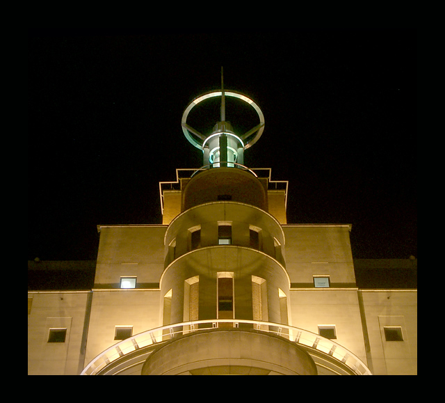
| This photo was one of the first I noticed when I came to DPC and it was one of the ones that motivated to really learn more about this art. I am also a lover of art deco and streamline moderne, which this invokes so much. |
|
 Photographer found comment helpful. Photographer found comment helpful. |
Comments Made During the Challenge  |
|
|
10/14/2003 05:43:27 PM |
maybe it's just my head, but the title, and the round structure onto are all implying superman things to me (metropolis, daily planet...) I'm expecting to see him in the shot for some reason. :)
an over all nice photo anyhow. |
|
| Photographer found comment helpful. |
|
|
10/14/2003 09:44:17 AM |
| Good night shot, Border is excessive, Good color. |
|
| Photographer found comment helpful. |
|
|
10/13/2003 02:35:00 PM |
| The yellow against the black is great, but that thick black border around the bottom just kills the effect. Good title! |
|
| Photographer found comment helpful. |
|
|
10/12/2003 07:57:21 PM |
| Excellent image. The concept is real good and the light superb. BTW one of my fav movie... Good luck 9 |
|
| Photographer found comment helpful. |
|
|
10/12/2003 03:01:01 PM |
This is gorgeous!! Like the structure of the building - circles and squares.
Nice job! |
|
| Photographer found comment helpful. |
|
|
10/12/2003 10:28:50 AM |
Wonderful, I've been trying to pick my "shot of the challenge" and it's been very hard. I love the deco feel of this, the colours and compostition. It's a shame you couldn't ask them to out the light in the window on the left!
IMO,, this is the winnder... a very deserved 10 |
|
| Photographer found comment helpful. |
|
|
10/11/2003 07:22:11 PM |
| Another one I like. A very simple design that pulls me in. |
|
| Photographer found comment helpful. |
|
|
10/11/2003 03:58:39 PM |
This is very reminiscent of the film to me - when she's in the chair being constructed...
Nice lighting and composition, but not quite urban enough maybe. |
|
| Photographer found comment helpful. |
|
|
10/10/2003 08:50:05 AM |
| I usually don't comment about the border, but this one is way too big. Not too bad because it blends in on the top, but it really takes away from the beauty of the photo on the bottom. I was really enjoying the symetry as the image came up, only to have the mood broken by the border. 8 and I'll not knock you down for the mistake. Please don't make the same mistake again. |
|
| Photographer found comment helpful. |
|
|
10/09/2003 11:23:00 PM |
| Very striking building. Lovely night shot. Too bad more of the building is not visible. Also IMO the thick black border around the whole image is not neccessary - there is anough blackness here as it is (unless this is a funeral hall). |
|
| Photographer found comment helpful. |
|
|
10/09/2003 10:40:25 AM |
| Well composed. Good exposure for the lighting. |
|
| Photographer found comment helpful. |
|
|
10/09/2003 09:00:38 AM |
|
|
|
10/09/2003 04:53:35 AM |
| Very nice, well done. A great photo of a really cool looking building. |
|
| Photographer found comment helpful. |
|
|
10/09/2003 03:30:42 AM |
|
| Photographer found comment helpful. |
|
|
10/08/2003 03:39:07 PM |
| feels a little tilted. interesting composition tho. nice work |
|
| Photographer found comment helpful. |
|
|
10/08/2003 03:25:57 PM |
| With the black night sky, your border seems a bit much. Overall I like the subject nd angle. |
|
| Photographer found comment helpful. |
|
|
10/08/2003 11:14:33 AM |
| Like the symmetry and impact - now just where is that robot? |
|
| Photographer found comment helpful. |
|
|
10/08/2003 11:00:46 AM |
| Nice shot. Perhaps a little more detail in the building would be good. |
|
| Photographer found comment helpful. |
|
|
10/08/2003 08:00:37 AM |
|
| Photographer found comment helpful. |
|
|
10/08/2003 03:10:52 AM |
| Visual appeal 4/4, technical 3/3, meeting the challenge 3/3 - 10/10 |
|
|
|
10/08/2003 01:38:08 AM |
picture quality 9
color combination 8
sharpness and contrast 10
theme concept 9
angle shoot 8
total 8.8(9) |
|
| Photographer found comment helpful. |
|
|
10/07/2003 10:15:54 PM |
| the cropping and choice of colour for border lost some marks. 6 |
|
| Photographer found comment helpful. |
|
|
10/07/2003 10:07:12 PM |
| I only wish this was totally symmetric in composition |
|
| Photographer found comment helpful. |
|
|
10/07/2003 09:55:56 PM |
| awesome shot! Great lighting captured...wonderful angle. |
|
| Photographer found comment helpful. |
|
|
10/07/2003 08:17:08 PM |
| Works very nicely. Like the black background. It is well lit. What was your exposure time? |
|
| Photographer found comment helpful. |
Home -
Challenges -
Community -
League -
Photos -
Cameras -
Lenses -
Learn -
Help -
Terms of Use -
Privacy -
Top ^
DPChallenge, and website content and design, Copyright © 2001-2025 Challenging Technologies, LLC.
All digital photo copyrights belong to the photographers and may not be used without permission.
Current Server Time: 04/07/2025 12:12:12 AM EDT.