| Author | Thread |
|
|
10/11/2006 08:46:05 PM |
| A good visual tribute to a good beer. Congratulations on your top ten finish. |
|
|
|
10/11/2006 07:29:41 PM |
| Exceptional idea and execution. |
|
|
|
10/11/2006 02:41:00 PM |
Congrats on the 6th place. Great shot!
|
|
|
|
10/11/2006 01:18:05 AM |
| Excellent shot man... Beautifully executed. Congrats on top 10. |
|
Comments Made During the Challenge  |
|
|
10/10/2006 10:46:08 PM |
| The lighting on this is excellent as is the title. |
|
|
|
10/10/2006 08:25:00 PM |
|
|
|
10/10/2006 10:32:48 AM |
|
|
|
10/10/2006 10:26:48 AM |
| I like the lighting and the props. Nice idea followed through with a great photo. |
|
|
|
10/10/2006 09:17:56 AM |
|
|
|
10/10/2006 06:45:35 AM |
| Terrific shot and composition |
|
|
|
10/10/2006 04:45:58 AM |
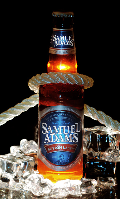
| Good thinking! Love the concept, but I'd like to see more "sweat" on the bottle as well as the light coming all the way through in the bottle... |
|
|
|
10/10/2006 02:18:01 AM |
| nice concept and wonderful lighting |
|
|
|
10/10/2006 01:44:44 AM |
|
|
|
10/09/2006 05:26:35 PM |
|
|
|
10/09/2006 12:00:08 PM |
| This is a spectacular shot! :) The rich tones and perfect balance of highlights and shadows really makes this one pop. The way that you lit the bottle and ice is awesome. :D |
|
|
|
10/09/2006 05:21:14 AM |
| another gorgeous image. good lighting. the only thing, optically its a bit tilted to the right. or is it just me. 9 |
|
|
|
10/08/2006 03:51:34 PM |
I don't get it, but then again I've never been to the states.
good lighting, but the rope confuses me. and icecubes, in beer? |
|
|
|
10/06/2006 05:42:56 PM |
| The lighting seems a tiiiiny bit unbalanced (eg there could be a bit more distinction on the bottle cap) (or maybe things look a bit unbalanced because of the slight asymmetry of the photo?), and the reflections in the bottom right of the image are a little distracting. However.... besides these very minor things, I think this image is perfect (and I can't bring myself to mark you down for any of these things!!) |
|
|
|
10/06/2006 02:27:31 PM |
| Wonderful lighting and setup here. |
|
|
|
10/05/2006 10:03:13 PM |
|
|
|
10/05/2006 07:59:40 PM |
|
|
|
10/05/2006 07:27:47 PM |
| :) but what is up with the text, looks like you have edited it... |
|
|
|
10/05/2006 12:16:19 PM |
cruel to me the viewer?
unusual to who mr. coors light drinker? |
|
|
|
10/05/2006 09:09:07 AM |
| I am missing condesation on the bottle with all that ice around. |
|
|
|
10/05/2006 12:31:57 AM |
| Excellent idea and execution! I'm sure this will ribbon! |
|
|
|
10/04/2006 12:44:33 PM |
| Nice shot. I would have liked just a little bit of light on the top to balance the highlights at the bottom of the image. |
|
|
|
10/04/2006 10:35:57 AM |
| Great idea...Lighting's a bit harsh and I might've asked for a less centered comp to allow space for text placement. I could still make this work. |
|
|
|
10/04/2006 09:23:59 AM |
| I like the back lighting, the top gets a little lost though. |
|
|
|
10/04/2006 06:54:50 AM |
| Good pic. More light on the top. |
|
|
|
10/04/2006 05:22:24 AM |
| this image would work as an ad...well done |
|
|
|
10/04/2006 03:36:22 AM |
| Good enough to have been a full page ad in a magazine ... ! |
|
|
|
10/04/2006 01:13:33 AM |
| Very creative and VERY well executed! |
|
Home -
Challenges -
Community -
League -
Photos -
Cameras -
Lenses -
Learn -
Help -
Terms of Use -
Privacy -
Top ^
DPChallenge, and website content and design, Copyright © 2001-2026 Challenging Technologies, LLC.
All digital photo copyrights belong to the photographers and may not be used without permission.
Current Server Time: 02/01/2026 09:05:24 AM EST.