| Author | Thread |
Comments Made During the Challenge  |
|
|
10/07/2006 05:36:31 AM |
| Lighitng is a bit harsh and I'm not sure if I understand the title. I like the association to that funny song. The comp is interesting but a full on view of the label would've served better. |
|
 Photographer found comment helpful. Photographer found comment helpful. |
|
|
10/05/2006 07:05:14 PM |
| Seems a bit out of focus and the lighting is a bit harsh on the left. I like how you zoomed in on the submect. |
|
| Photographer found comment helpful. |
|
|
10/05/2006 05:06:31 PM |
| One of the better ones this time around! I like the color contrast here. |
|
| Photographer found comment helpful. |
|
|
10/05/2006 02:06:08 PM |
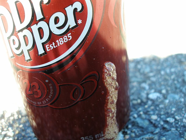
| Too sexy for your can so you spit on the can? What is that? This idea isn't bad, and if the Dr Pepper logo were fully in the frame it would make a decent advertisement. Is the blue stuff at the bottom foam? Blue foam is probably not going to sell much Dr Pepper... Might have a whitebalance issue there. Good luck. |
|
|
|
10/04/2006 06:26:46 AM |
| Image is a bit washed out on the left side and right upper side. |
|
| Photographer found comment helpful. |
Home -
Challenges -
Community -
League -
Photos -
Cameras -
Lenses -
Learn -
Help -
Terms of Use -
Privacy -
Top ^
DPChallenge, and website content and design, Copyright © 2001-2025 Challenging Technologies, LLC.
All digital photo copyrights belong to the photographers and may not be used without permission.
Current Server Time: 04/08/2025 05:49:05 PM EDT.