| Author | Thread |
|
|
06/12/2007 02:06:42 PM |
| Love the use of contrast here, and especially like how everything gradually disappears into black at the top. |
|
 Photographer found comment helpful. Photographer found comment helpful. |
|
|
10/17/2006 05:13:45 PM |
Greetings from the Critique Club
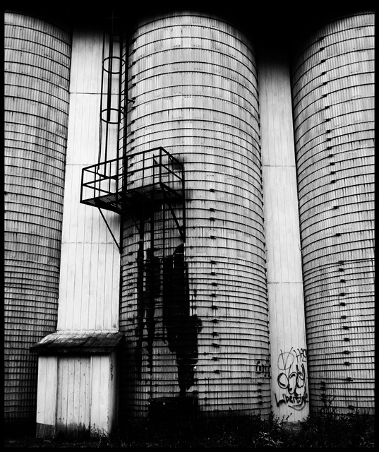
Interesting image with lots to look at and composed so that it is a pleasure to linger. I like the way it is stopped at top and bottom with darkness (and I looked at it many different ways on my monitor).
You selected a good crop here, I think.
I also like the way you made your lens work in your favor in this image by having the towers lean in towards something strong in the middle. The bleakness indicated by the strong black & white, coupled with the graffiti make this a good, compelling image.
Considering the tough field of competition in this Challenge, I'll just say, "Good one" and let it go at that.
Keep up the good work, and a reminder: there's always room in the Critique Club for people of your caliber if you have a little time to spare.
SFAlice |
|
| Photographer found comment helpful. |
Comments Made During the Challenge  |
|
|
10/09/2006 07:24:02 PM |
|
| Photographer found comment helpful. |
|
|
10/09/2006 05:17:36 AM |
| Great location, very good interpretation of the challenge. |
|
| Photographer found comment helpful. |
|
|
10/04/2006 11:09:00 AM |
i really like this, great eye!
Message edited by author 2006-10-12 02:43:25. |
|
| Photographer found comment helpful. |
Home -
Challenges -
Community -
League -
Photos -
Cameras -
Lenses -
Learn -
Help -
Terms of Use -
Privacy -
Top ^
DPChallenge, and website content and design, Copyright © 2001-2025 Challenging Technologies, LLC.
All digital photo copyrights belong to the photographers and may not be used without permission.
Current Server Time: 04/09/2025 06:11:26 PM EDT.