| Author | Thread |
|
|
10/22/2006 12:05:59 PM |
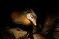
| What hurt you the most for scoring in this challenge is this isn't really what most would consider "high contrast". If you look at a histogram of this picture in Photoshop, you'll see a fairly nice spread across the board, with no significant peaks/valleys. Yes, the high constrast of the sun on the water at the point where the island is does define the island, but that's a small portion of the picture so the overall impact is not one of high contrast. As for the lens flare, I kinda like it. Looks a bit like the moon, though it is recognizable as a flare. An adjustment of 50% in the shadows using the shadows/highlight tool in Photoshop really brings out the colors and textures in the foreground. |
|
 Photographer found comment helpful. Photographer found comment helpful. |
Comments Made During the Challenge  |
|
|
10/06/2006 08:07:36 PM |
| I don't really see how this has anything to do with contrast, and there's a water mark from your lense at the top of the photo |
|
| Photographer found comment helpful. |
|
|
10/06/2006 07:10:16 AM |
| I think the colors could be pushed a tiny bit more to get them to really contrast. |
|
| Photographer found comment helpful. |
|
|
10/04/2006 04:24:49 PM |
| I'm not seeing much high contrast here. |
|
| Photographer found comment helpful. |
Home -
Challenges -
Community -
League -
Photos -
Cameras -
Lenses -
Learn -
Help -
Terms of Use -
Privacy -
Top ^
DPChallenge, and website content and design, Copyright © 2001-2025 Challenging Technologies, LLC.
All digital photo copyrights belong to the photographers and may not be used without permission.
Current Server Time: 04/07/2025 11:10:05 AM EDT.