| Author | Thread |
Comments Made During the Challenge  |
|
|
10/10/2006 06:33:07 PM |
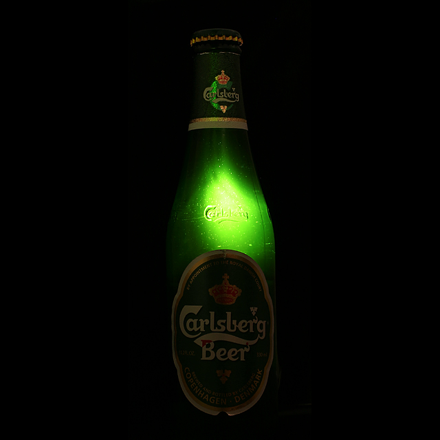
| LOVE IT! MAYBE JUST A BIT MORE LIGHT ON THE LABLE... BUT STILL LOVE IT!!! 9 |
|
 Photographer found comment helpful. Photographer found comment helpful. |
|
|
10/10/2006 06:31:12 PM |
| Interesting use of lighting here. It would be nice if there was just a touch of fill flash to light up the label on the front of the bottle. Still very effective. |
|
| Photographer found comment helpful. |
|
|
10/09/2006 11:18:12 PM |
|
| Photographer found comment helpful. |
|
|
10/09/2006 04:04:33 PM |
| Nice idea, but the label needs more light from the front. |
|
| Photographer found comment helpful. |
|
|
10/08/2006 04:12:41 PM |
| It's Magically Delicious! |
|
| Photographer found comment helpful. |
|
|
10/07/2006 04:45:10 PM |
| The title made me vote on this one..... |
|
| Photographer found comment helpful. |
|
|
10/05/2006 08:40:09 PM |
| Great, great idea and execution. Excellent title and idea for a complete campaign. Would like a bit more light on the label for brand identification and a less centered comp to help with text placement. Still this is the type of professional quality I like to see come across my desk |
|
| Photographer found comment helpful. |
|
|
10/05/2006 05:22:54 PM |
yes, it's called beer! :)
good lighting. for some reason the bottle seems to be leaning a little bit left and forward.
should be in top 5 |
|
| Photographer found comment helpful. |
|
|
10/05/2006 12:13:16 PM |
could be cool.
needs a subltle front light and the lighted "Carlsberg" needs to be more defined. |
|
| Photographer found comment helpful. |
|
|
10/04/2006 11:34:54 PM |
| This is genius, made me laugh and it also intrigued me. |
|
| Photographer found comment helpful. |
|
|
10/04/2006 04:31:03 PM |
| Nice idea, lighting is cool! |
|
| Photographer found comment helpful. |
|
|
10/04/2006 12:27:33 PM |
| A bit more light on the label would have been nice. |
|
| Photographer found comment helpful. |
|
|
10/04/2006 10:42:26 AM |
| Nice attempt (and exectution) for lighting effects, but they seem to actually hinder the viewer's perception of product name rather than help. Perhaps if the light on the Carlsberg was just below it or just above it would not wash out the name. |
|
| Photographer found comment helpful. |
|
|
10/04/2006 09:57:19 AM |
| Interesting idea. It puts focus on the only thing in the room. :) |
|
| Photographer found comment helpful. |
|
|
10/04/2006 06:57:57 AM |
| its too dark. I've tried this too and the same problem. you should enhance the brand... |
|
|
|
10/04/2006 05:23:09 AM |
| great on the back cover of a magazine...there's enough branding there to suggest the carlsberg, love it |
|
| Photographer found comment helpful. |
|
|
10/04/2006 12:49:16 AM |
| With lighting on the label and a bottle where the seam is more to the side this could be really neat. |
|
| Photographer found comment helpful. |
Home -
Challenges -
Community -
League -
Photos -
Cameras -
Lenses -
Learn -
Help -
Terms of Use -
Privacy -
Top ^
DPChallenge, and website content and design, Copyright © 2001-2026 Challenging Technologies, LLC.
All digital photo copyrights belong to the photographers and may not be used without permission.
Current Server Time: 02/01/2026 12:29:13 PM EST.