| Author | Thread |
Comments Made During the Challenge  |
|
|
10/08/2006 07:19:27 AM |
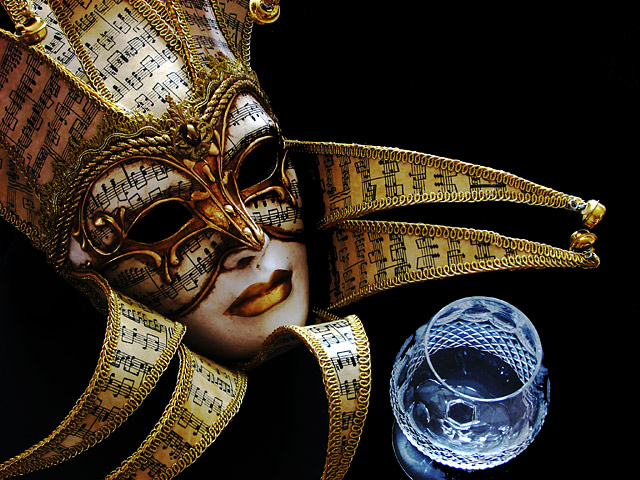
| As a point of order, in my experience of masques and carnivale and the like, glasses and masks are hardly unrelated. Whatever; good detailing and light on the mask - and it's a beautiful object too - but your inclusion of the glass seems entirely arbitrary: it's appears oriented differently, weakly placed compositionally - to the extent that one might believe, if told, that it was cropped out of a different photograph; and that was the challenge, I think - to make photographic sense out of the combination. I don't really think you've succeeded - it needs the feeling that these two unrelated objects are at least in the same light space, or something - but I like the mask very much. |
|
 Photographer found comment helpful. Photographer found comment helpful. |
|
|
10/06/2006 01:15:19 PM |
| The mask shines out very well. |
|
| Photographer found comment helpful. |
|
|
10/06/2006 10:50:07 AM |
| like the details in the mask and glass. they play off each other nicely. |
|
| Photographer found comment helpful. |
|
|
10/06/2006 08:55:01 AM |
| This would be so much better without the glass, but then it probably wouldn't meet the challenge. :-) Incredible mask, very well lit. The glass, however, just doesn't make sense photographically. |
|
| Photographer found comment helpful. |
|
|
10/05/2006 08:04:58 PM |
| Good composition. Nice lighting and great detail. |
|
| Photographer found comment helpful. |
|
|
10/05/2006 11:46:15 AM |
| I would like this better if the glass had less cropped on bottom. However, beautiful lighting and exposure. |
|
| Photographer found comment helpful. |
|
|
10/04/2006 08:39:01 PM |
| I really like this - one of the more elegant photos in the challenge. The only nitpick I have is the fact that the glass is cut off on the bottom. 9. |
|
| Photographer found comment helpful. |
|
|
10/03/2006 10:37:59 PM |
| Splendid mask, and brilliantly positioned. The glass isn't up to par with the mask, but still the mask is so spectacular that you almost don't care about the glass. Fabulous lighting and coloration. Black background is very effective with this subject. Well done. |
|
| Photographer found comment helpful. |
|
|
10/03/2006 06:04:44 PM |
| Great subject... I find the glass lacking in comparison. |
|
| Photographer found comment helpful. |
|
|
10/02/2006 12:20:47 AM |
|
| Photographer found comment helpful. |
Home -
Challenges -
Community -
League -
Photos -
Cameras -
Lenses -
Learn -
Help -
Terms of Use -
Privacy -
Top ^
DPChallenge, and website content and design, Copyright © 2001-2026 Challenging Technologies, LLC.
All digital photo copyrights belong to the photographers and may not be used without permission.
Current Server Time: 02/01/2026 11:18:30 AM EST.