| Photograph Information |
Photographer's Comments |
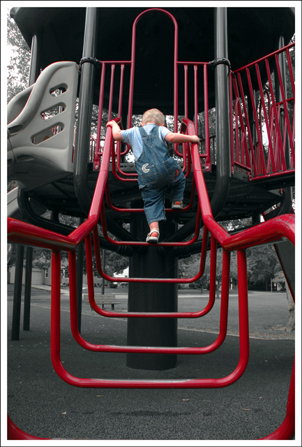
Challenge: Leading Lines III (Basic Editing III)
Camera: Canon EOS-300D Rebel
Lens: Canon EF 50mm f/1.8 II
Location: Selby Park, Worthington, OH
Date: Sep 15, 2006
Aperture: 5.7
ISO: 200
Shutter: 1/125
Galleries: Action, Children
Date Uploaded: Sep 15, 2006
|
Was hoping for something more dramatic for this challenge. Playing at the playground I took a couple of these shots of Rowan climbing up this ladder thingee. Nothing amazing but I really like this shot. I want to try and emulate some of the success that  metatate has had with pictures of his daughter. Hoepfully this will be the first of more to come. metatate has had with pictures of his daughter. Hoepfully this will be the first of more to come.
Post process - levels, desat yellows and greens, saturated the rest, lightened, curves, selective color adjustments, increased canvas size for border and stroked, USM, resize for web. No cropping or rotating - I am getting better at envisoning my end product I guess.
Post Challenge - My decision to do the selective desat was primarily because of how much diustracting elements there were int he background between colors and stuff. Looking back at it I relaize that slightly reducing the background colors would have possibly had a better effect. Staright black and white didnt work. |
| Author | Thread |
|
|
10/05/2006 06:15:31 AM |
Trading post...
Nice lines! I don't really care for the selective desat. I didn't vote in this challenge but probably would have gone 5 or 6. While the lines intially lead you up to your daughter, the red after that pulls you to the side which seems to have some kind of weird tilt to it. |
|
 Photographer found comment helpful. Photographer found comment helpful. |
|
|
10/03/2006 02:49:40 PM |
| Rowan this time! Not sure about the desat, but reading your explanation, I can understand why you did it. I don't mind "busy" when it serves a purpose, and it doesn't bother me here at all. In fact it serves as kind of a neat contrast - all the busy hard lines and and metal and plastic edges comtrasted with a lovely little girl and her concentration. |
|
| Photographer found comment helpful. |
|
|
09/28/2006 07:46:24 PM |
I see what you were going with on the selective desat, but I'm not sure it works. This is coming from a guy who likes selective desat (not everybody on the site does). A good example is the group of bars on the upper right. They don't help and the desat actually makes them worse.
I like what you were going for, but probably the setting was just too jumbled (which you sensed) for a great leading lines shot. The little man is quite cute though. I love overalls. |
|
| Photographer found comment helpful. |
|
|
09/28/2006 03:22:44 PM |
| Glad not so many people agreed with me and that you got a decent score ;-) |
|
| Photographer found comment helpful. |
Comments Made During the Challenge  |
|
|
09/26/2006 07:21:47 PM |
|
| Photographer found comment helpful. |
|
|
09/24/2006 01:57:21 PM |
|
| Photographer found comment helpful. |
|
|
09/22/2006 11:10:53 AM |
|
| Photographer found comment helpful. |
|
|
09/21/2006 11:08:38 AM |
| The red color and the subject made the shoot. Nice catch. |
|
| Photographer found comment helpful. |
|
|
09/21/2006 07:51:36 AM |
| good composition. I'd love to see this as a black/white. |
|
| Photographer found comment helpful. |
|
|
09/20/2006 08:10:13 AM |
| I wonder if this is basic editing? |
|
| Photographer found comment helpful. |
|
|
09/20/2006 06:29:31 AM |
| The composition is very good and so is the subject. The desat effect cheapens the image and in playing to the gallery I think that you have lost much of beauty in it. I would have chosen black and white or duotone to present this. The frame works well. |
|
| Photographer found comment helpful. |
Home -
Challenges -
Community -
League -
Photos -
Cameras -
Lenses -
Learn -
Help -
Terms of Use -
Privacy -
Top ^
DPChallenge, and website content and design, Copyright © 2001-2025 Challenging Technologies, LLC.
All digital photo copyrights belong to the photographers and may not be used without permission.
Current Server Time: 04/07/2025 09:15:23 PM EDT.