| Author | Thread |
Comments Made During the Challenge  |
|
|
09/14/2006 07:29:54 PM |
| I would prefer a larger image. And the little clipped corners are distracting. |
|
|
|
09/14/2006 07:02:37 PM |
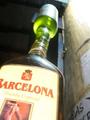
| The reddish cast to the photo is (I'm assuming) from the red lights of a developing room...but it's a little hard for me to see the details of the photo at this size. |
|
|
|
09/14/2006 09:52:34 AM |
| This looks like a detailed shot. Unfortunately it's too small to see the details. |
|
|
|
09/13/2006 07:05:18 PM |
| Make sure to use the whole 640pixels so we can see the detail |
|
|
|
09/13/2006 05:12:42 PM |
| really ity bity image. It looks nice, but doesn't give me enough pow factor. |
|
|
|
09/13/2006 06:42:18 AM |
| Nice idea but it needs to be a bit bigger and more dynamic in composition. |
|
|
|
09/12/2006 11:33:53 PM |
| a bit small, and why the white corners? |
|
|
|
09/12/2006 09:23:37 PM |
| The image size is too small to really inspect thoroughly. |
|
|
|
09/12/2006 09:16:42 PM |
Whats with the white corners and small size, not a strong move !
The idea is good and the colour is also pretty good but you can't see any details due to the size. |
|
Home -
Challenges -
Community -
League -
Photos -
Cameras -
Lenses -
Learn -
Help -
Terms of Use -
Privacy -
Top ^
DPChallenge, and website content and design, Copyright © 2001-2025 Challenging Technologies, LLC.
All digital photo copyrights belong to the photographers and may not be used without permission.
Current Server Time: 04/07/2025 02:02:41 PM EDT.