| Author | Thread |
|
|
09/08/2006 07:46:34 PM |
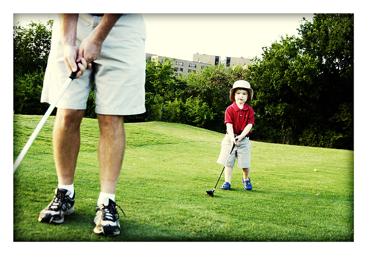
| I find the picture extremely pleasing.. only one issue.. on the far right.. is that a golf ball sittin by itself? |
|
 Photographer found comment helpful. Photographer found comment helpful. |
|
|
09/08/2006 12:29:24 PM |
I've been around golf & driving ranges...first two things I notice are the background building/sky and the distance between father/son. also hurting the scene is that the boy doesn't have a golf ball. the pose on both suggest the boy could be looking at a male stranger. a lot of my experience suggests that the father is usually behind the son, so to be able to watch the son. I think you'd have a great capture of the boy looking back over his shoulder at what daddy is doing. as far as the processing, i like the nostalgic look of the colors. hope this helps,
Josh
e.t.a....usually the 'bond' in teaching the game (father/son or player/coach) is the two facing each other or the 'teacher' is standing facing the range. if you're on a range and you don't want anyone to bother you and want to be left alone, you have your back to range.
Message edited by author 2006-09-08 16:34:32. |
|
| Photographer found comment helpful. |
|
|
09/08/2006 11:43:43 AM |
| I love the concept, and I like the tilt and the vig. Only change I would maybe suggest is to see a bit more detail on the expression, and maybe have daddy a bit more OOF. I really like the suggestion to do a whole series of these I think even if you didn't do the stock stuff with it, well it would be wonderful stuff for personal memories and the like! Great shot IMHO. |
|
| Photographer found comment helpful. |
|
|
09/08/2006 10:31:56 AM |
| Very nice capture - really gets the moment with the boy's expression as he concentrates on imitating the golfer. Technically it doesn't look over processed to me, the tilt and vignette works, and the border is okay. The buildings in the background are a little distracting, but I guess there wasn't much you could do about that! |
|
| Photographer found comment helpful. |
|
|
09/08/2006 10:31:08 AM |
Overexposed - hah! Don't any of these people read magazines? Look at catalogs?
it's great, just the way it is.
It looks like it's ready to go in a magazine.
Here's my thing with DPC and it's voters - I think comments and voting are all biased toward wall art - a mere tiny fraction of the uses of photography in this media hungry society.
So go shoot the rest of this series - driving, putting, irons, sand traps, driving the carts, and process them all like this and get them up on a macro stock site and just wait for the money to come in! Love this whole concept.
|
|
| Photographer found comment helpful. |
|
|
09/08/2006 10:16:08 AM |
| How cute!!! I played with the crop and got rid of the building and top, and it still showed enough of Dad. What do you think???? |
|
| Photographer found comment helpful. |
|
|
09/08/2006 10:11:21 AM |
| This is fantastic! I love the processing and the border you put on it. I love the fact they both have the same shorts. He is imitating daddy very well! Priceless! |
|
| Photographer found comment helpful. |
|
|
09/08/2006 10:10:10 AM |
| Nicely done. I am not a big fan of tilt, as a matter of fact, I usually hate it. However, there are certain images that it works very well in. This is one of those images. The tilt adds the fell of action and movement for this one. Perhaps it is a bit over exposed, but it works well with the overall feel of the image. The only thing that bothers me is the shadow around the edge. I'd like to see a version without it before I made a final decision on whether it should be there or not. Either way, I like the image and I think the post-processing is also well-done. |
|
| Photographer found comment helpful. |
|
|
09/08/2006 10:00:09 AM |
| It may be a bit overexposed, but that doesn't bother me at all. It's a great picture - I love the composition of it. I like that daddy isn't fully in the picture nor in focus. I LOVE the expression on the budding golfer's face. In my opinion - it's definitely a "frame it and hang it" shot. |
|
| Photographer found comment helpful. |
|
|
09/08/2006 09:53:10 AM |
| i think this is a good pic, liek the dinamic of it, the post proces is good, but i was wondering.. what happend if you try to give a little tone in it? |
|
| Photographer found comment helpful. |
|
|
09/08/2006 09:50:04 AM |
| I'll agree with previous posters regarding the over exposure ... I love the red shirt and blue crocs ... they draw my eye right to the child ... good job! |
|
| Photographer found comment helpful. |
|
|
09/08/2006 09:34:48 AM |
i agree over exposed not over processed but i also dont like the tilt. i do like the processing very much.
Message edited by author 2006-09-08 13:35:15. |
|
| Photographer found comment helpful. |
|
|
09/08/2006 09:32:27 AM |
| I don't mind the processing. It creates a dreamy, nostalgic mood. But I think his red shirt should be a little less bright to help the dreaminess. I'd rather have my eyes drawn to him by the composition than by the color. |
|
| Photographer found comment helpful. |
|
|
09/08/2006 09:29:08 AM |
| I like it. It may be a tad overexposed but it works for this image. The look on the kids face is priceless. |
|
| Photographer found comment helpful. |
|
|
09/08/2006 09:25:12 AM |
| I don't think its over processed. I think its a bit over exposed, but the composition and processing makes that look intentional. Nice shot. |
|
| Photographer found comment helpful. |
Home -
Challenges -
Community -
League -
Photos -
Cameras -
Lenses -
Learn -
Help -
Terms of Use -
Privacy -
Top ^
DPChallenge, and website content and design, Copyright © 2001-2025 Challenging Technologies, LLC.
All digital photo copyrights belong to the photographers and may not be used without permission.
Current Server Time: 04/07/2025 02:37:24 PM EDT.