Greetings from the Critique Club. My critiques are generally geared towards trying to help you improve your score within DPC, and not on any true "artistic" merit of the photograph itself, unless it relates to DPC voters and scoring. Please keep that in mind as you read this.
Initial Thoughts
A nice shot, but something doesn't feel right.. missing that edge.
Composition/Content
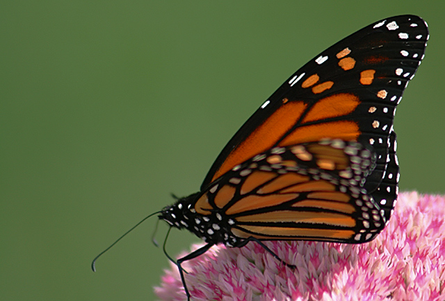
For me, the composition feels a little too crowded into the corner here. Some more negative space would have really helped, especially to sell the "flower" portion of your title. Everything just seems so crowded into that one little space, and the negative space you *do* have doesn't really play well with that.. making it only seem more so, instead of isolating the subject as it should. As I said, leaving more room around the butterfly would have helped this particular photo out a lot.. in my mind.
Background
A good OOF background, but the green color is a little too flat and works against the colors of the flower and the butterfly. There is a lot of clashing going on there.
Camera Work/Technical
Good DOF, but I see a lot of camera shake. I'm curious as to what focal length you were at here, and assume you were getting between 200-300mm? At 1/320, you would have wanted to be somwhere around 150mm.. any more than that and you risk what happened here, unless on a tripod. IS might have helped, but if you were using it, it didn't show up well here, or maybe even hindered this photo.
Digital Processing
This image, IMO, is far too "flat" an image for a really good score on DPC. Camera shake aside (which probably also caused a few lower votes), the color really clashes here, but not in a good way.. in a way that produces any pop. You are left with an image that looks very 2-dimensional, even with a shallower DOF. Some boosts in Contrast, a little more work with a Selective Color adjustment to get some stronger, deeper color, and perhaps getting that background out of that flat pea green color would have all helped. DPC really requires you to have something extra .. intense.. to place really high. Colors that work well together, sharp, sharp images, and moody contrasty images. What I see here is almost the opposite of that. While it is still a decent photograph for what it is, it simply lacks that DPC-ness it needs.
Fits the Challenge
I don't have any personal connection to flowers *or* butterflies as "pleasures", really.. but anything that promotes a sense of calm and peacefulness can't be all bad, and I'm sure you resonated well with many voters.
My Opinion of the Photo
Nothing particularly engaging here for me. Butterflies on flowers shots are a dime a dozen, and they require something really special to shine on a website where we are bombarded with a dozen such photos a day.. Doesn't mean we should stop trying, however, and this is a good step toward the end DPC purpose.