| Author | Thread |
Comments Made During the Challenge  |
|
|
08/04/2002 05:18:00 PM |
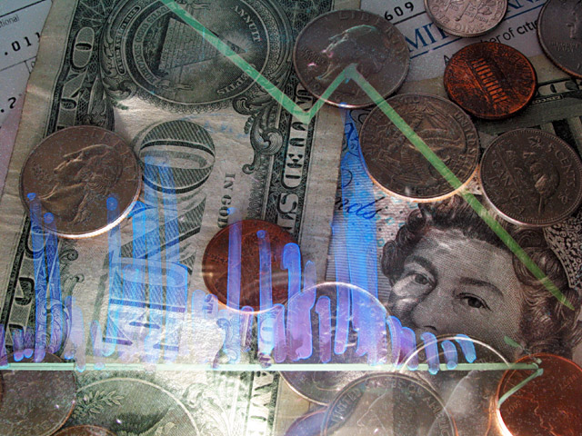
| I don't understand the blue scribbly bits. Probably being thick. |
|
|
|
08/04/2002 05:13:00 PM |
| clever to use transparency |
|
|
|
08/02/2002 11:13:00 PM |
| I like the composition of this picture -- it really holds my attention. It is a little bright in the lower part, but nothing major to me. karmat |
|
|
|
08/01/2002 02:26:00 PM |
| too bright at the bottom of the image. I do like the graph image on top of the coins |
|
|
|
08/01/2002 10:03:00 AM |
| The lighting on this shot is really rough -- maybe you could have lit it from the sides? Cool idea, though. |
|
|
|
07/31/2002 07:08:00 PM |
|
|
|
07/31/2002 04:16:00 PM |
| I'll have to look at this some more before I decide. I'll try to get back with more comments. |
|
|
|
07/31/2002 03:31:00 AM |
| amazing, how did u do it? |
|
|
|
07/30/2002 11:25:00 PM |
Composition - good
Technical Aspects - ok. The overlay bothers me a little
Meets Challenge - yes
Visual Impact / Originality -good
|
|
|
|
07/30/2002 07:54:00 AM |
| A fine concept but the blue hand drawn lines look like jets of gas. Not immediately understandable enough. |
|
|
|
07/30/2002 07:07:00 AM |
| Ah, a picture with a positive political overtone; I like this (how did you achieve the reflection?) My only criticism would be to say that it's a bit busy, too many objects for my liking. But, I like the Queen's eyes… |
|
|
|
07/30/2002 12:10:00 AM |
| I really like the idea of this photo. The glare in the bottom center is distracting from the blue bar graphs(?). |
|
|
|
07/29/2002 11:21:00 PM |
| At first the light at the bottom bothered me, but I got over it... This is a 10 |
|
|
|
07/29/2002 10:34:00 PM |
| ohhh... is that a transparency lying over the money? I couldn't tell what it was. Pretty cool effect. 6 Lisa |
|
|
|
07/29/2002 10:00:00 PM |
| I like the way you have used a glass to draw a graph. However, you did such a nice job with the green graph the blue streaks take a lot away from the photo. Good concept on money. Instead of the graph, using a blue globe would have definitely fit the title much better. |
|
|
|
07/29/2002 09:08:00 PM |
| clever idea for a tough challenge! Light direction could improve. The glare is a distraction from what could have been a terrific shot. Nice! |
|
|
|
07/29/2002 07:53:00 PM |
| This seems like a wonderful concept. I want to think the transparency graph makes some sort of sense, but I don't see it. (It's the blue/red lines that don't seem to correlate to the green line.) I don't lke how this is lit. The bottom is too bright and the top is too dark, with a whole lot of interesting viewables hidden by that lighting. The graph is a cool idea, but I don't like the "hand drawn" look to it. (Kinda resembles Arabic, to me) I started this out as a 6, wanted to take you up to 7, but talked myself out of it. 6 Swash |
|
|
|
07/29/2002 05:58:00 PM |
| like the diving graph reflection. |
|
|
|
07/29/2002 03:38:00 PM |
|
|
|
07/29/2002 01:02:00 PM |
| I like this... I like that it isn't just a shot of money like so many others...I like the graph overlay. Great job...10 |
|
|
|
07/29/2002 05:04:00 AM |
| ...around the hell (usually). Good idea but... there is a big reflection you could have avoided. |
|
|
|
07/29/2002 02:39:00 AM |
| not bad at all, I like the effect... 8 |
|
|
|
07/29/2002 02:14:00 AM |
| goodlight...the dead is the dead... |
|
|
|
07/29/2002 12:57:00 AM |
| interesting concept... i think the lighting is a little harsh on the bottom of the image... - jmsetzler |
|
Home -
Challenges -
Community -
League -
Photos -
Cameras -
Lenses -
Learn -
Help -
Terms of Use -
Privacy -
Top ^
DPChallenge, and website content and design, Copyright © 2001-2026 Challenging Technologies, LLC.
All digital photo copyrights belong to the photographers and may not be used without permission.
Current Server Time: 02/01/2026 12:00:21 PM EST.