| Author | Thread |
Comments Made During the Challenge  |
|
|
09/12/2006 08:41:09 PM |
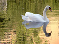
| My eyes get so tired of looking at all of these bright, saturated photos that one like this is a welcome repreive. Cool. |
|
|
|
09/12/2006 01:23:02 PM |
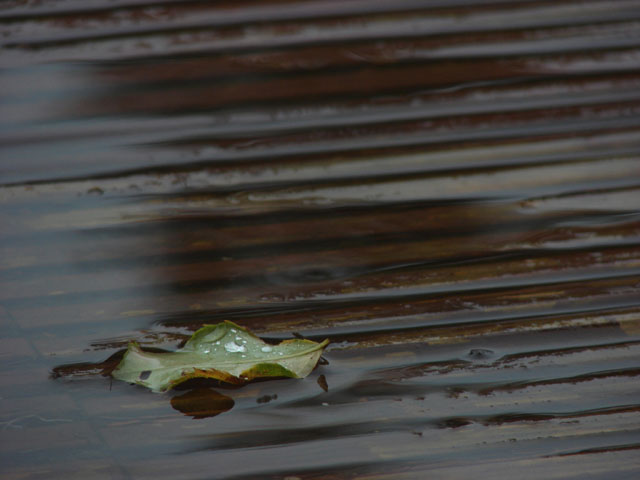
| it's so hard to explain what is good or bad about a picture that works on a purely visual level. This one almost works for me. I think what's detracting is all that light on the left. For some reason it makes me see the entire deck and it ruins the illusion that the whole world exists inside the frame. 6 |
|
|
|
09/12/2006 12:16:41 AM |
| nice color combo. i like the lines. |
|
|
|
09/09/2006 01:28:50 AM |
| The glare to the left almost looks like the photo was taken through a window...I still like it. 8 |
|
|
|
09/08/2006 01:43:02 AM |
|
|
|
09/06/2006 06:36:05 PM |
| This seems a little too simple. It does not have any pop at all. |
|
|
|
09/06/2006 04:49:18 PM |
| I like that the leaf is in the same direction as the boards. Nice job. |
|
Home -
Challenges -
Community -
League -
Photos -
Cameras -
Lenses -
Learn -
Help -
Terms of Use -
Privacy -
Top ^
DPChallenge, and website content and design, Copyright © 2001-2026 Challenging Technologies, LLC.
All digital photo copyrights belong to the photographers and may not be used without permission.
Current Server Time: 02/01/2026 11:50:07 AM EST.