| Author | Thread |
|
|
09/16/2006 05:32:18 AM |
Greetings from the critique Club.
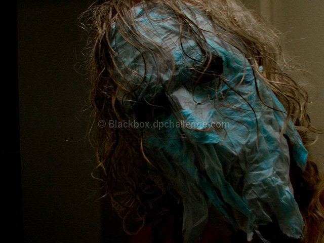
This image is definantly in your face so I will address this from a couple of angles. I for one love in your face horror type images.DPC as a whole does not. There are some people that do, so you will get some good scores from them but for the most part you will not get a good score here from images with a horror element. Of course there have been a few recently that did well so maybe that will change:)
Another thing that I feel kept your score down in this challenge is the darker tone in general. As you can see by the top scores, Bright colors and tones were what the voters were looking for.
Ok so in the end scores are less important than if you like the photo so lets get to how I feel you can improve that. The background is not really helping you here. for this type of photo an entirly dark background could have worked well for me but the half white half black just doesn't work for me. maybe if you had turned the camera so that the dark parts were behind the entire frame. Then you could have used levels in your editing program to help darken and even out the background. the photo seems to have some noise which will happen of course but one way to help have less of it is to expose a little more. with your f 2.7 and ISO 50 are probably too low for this lighting. keep in mind that you can darken the photo later if you want that type of mood. a higher f number will help you get more of a depth of field which will help you get more of you in focus
The first thing that came too my mind seeing this was Kane from the WWE I am not sure if this is what you were going for but if so you did it well. Keep up the good work and continue to think out of the box. I hope this has helped.
Elvis |
|
 Photographer found comment helpful. Photographer found comment helpful. |
Comments Made During the Challenge  |
|
|
09/09/2006 09:05:17 PM |
| yikes! but it certainly meets the challenge. 8 - for pure unique out-of-the-box thinking. A great change from all the flowers. |
|
| Photographer found comment helpful. |
|
|
09/09/2006 08:34:18 PM |
|
| Photographer found comment helpful. |
|
|
09/09/2006 05:19:34 PM |
|
| Photographer found comment helpful. |
|
|
09/09/2006 04:22:57 PM |
|
| Photographer found comment helpful. |
|
|
09/04/2006 11:57:07 AM |
| Wow, very creepy! Could be in a horror movie. I don't think it fits this challenge, though, I think it is too dark. |
|
| Photographer found comment helpful. |
|
|
09/04/2006 08:44:04 AM |
|
| Photographer found comment helpful. |
|
|
09/04/2006 04:48:20 AM |
| I like where you were going, but too dark for the pastel challenge. imho |
|
| Photographer found comment helpful. |
|
|
09/04/2006 12:59:04 AM |
| I see you've met my ex-wife. She seems to be aging about the way I envisioned. |
|
| Photographer found comment helpful. |
|
|
09/04/2006 12:52:06 AM |
| refreshing entry for this challenge |
|
| Photographer found comment helpful. |
|
|
09/03/2006 10:45:52 PM |
|
| Photographer found comment helpful. |
|
|
09/03/2006 10:16:07 PM |
| hmm. dark and pastel are sorta at odds as far as the color/tone spectrum is concerned. I bet this was fun to do though. |
|
| Photographer found comment helpful. |
|
|
09/03/2006 09:14:20 PM |
|
| Photographer found comment helpful. |
|
|
09/03/2006 08:37:08 PM |
| Not the best photo, but a welcome change from colored pencils and flowers. Very creative, good work. |
|
| Photographer found comment helpful. |
Home -
Challenges -
Community -
League -
Photos -
Cameras -
Lenses -
Learn -
Help -
Terms of Use -
Privacy -
Top ^
DPChallenge, and website content and design, Copyright © 2001-2025 Challenging Technologies, LLC.
All digital photo copyrights belong to the photographers and may not be used without permission.
Current Server Time: 04/13/2025 04:06:20 AM EDT.