| Author | Thread |
|
|
09/18/2006 07:14:57 AM |
Hello from the Critique Club,
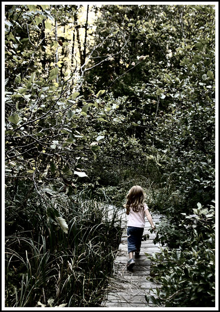
During the challenge, I rated this image a 5. My first impressions were that the subject met the challenge but the post processing made the image look scary instead of pleasurable. Coming back to review this image, it dawned upon me that the scariness could have been muted by cropping out half of the negative space above the girl. This would have made the trees look a little less ominous and by eliminating the bright light coming through the trees, provided a softer feel to the image to reflect the intentional desaturation.
Feel free to PM me if you have any questions regarding this critique.
Tim
|
|
 Photographer found comment helpful. Photographer found comment helpful. |
|
|
09/13/2006 07:50:37 AM |
| What I like most about this is that the noise and clutter of the vegetation makes it seem aggressive and adds a sense of scariness to the shot, but there is also a sense of supreme confidence in the girl. Scariness + confidence = Adventure!! Maybe that's why the quasidesaturation works, because it gives it a pulp-novel-cover feel. |
|
| Photographer found comment helpful. |
Comments Made During the Challenge  |
|
|
09/12/2006 07:09:32 PM |
| Very nice. I like this shot alot. Reminds me of one of my wifes pics. Bumping up. |
|
| Photographer found comment helpful. |
|
|
09/12/2006 11:04:47 AM |
| The leader - blazing a trail. Nicely photographed. |
|
| Photographer found comment helpful. |
|
|
09/11/2006 07:28:17 PM |
| this photo definitely screams PLEASURE |
|
| Photographer found comment helpful. |
|
|
09/09/2006 10:07:06 PM |
| Awesome composition, I like the lighting. Great idea. 7. |
|
| Photographer found comment helpful. |
|
|
09/09/2006 12:25:05 PM |
| Consider cropping a little, making the girl more of a focus and getting rid of the upper left hand corner (it is distracting). By doing this, you could then add more contrast and more detail in the leaves. |
|
| Photographer found comment helpful. |
|
|
09/08/2006 04:28:23 PM |
| is this with selective coloring or with a muted setting on the camera? |
|
| Photographer found comment helpful. |
|
|
09/08/2006 06:06:24 AM |
| The color seems to be off, but good idea and composition. |
|
| Photographer found comment helpful. |
|
|
09/06/2006 07:01:13 PM |
| Great composition and the use of thirds. |
|
| Photographer found comment helpful. |
|
|
09/06/2006 12:13:50 PM |
| this reminds me a botonical garder near my house!!! |
|
| Photographer found comment helpful. |
|
|
09/06/2006 09:22:54 AM |
| Nicely composed but the colours are a little too muted IMHO. |
|
| Photographer found comment helpful. |
|
|
09/06/2006 08:27:55 AM |
| This should have been a B&W. There just isn't enough color in the bushes to keep it a color image. Perhaps making the image B&W and keeping the girl in color would have helpe give this image the punch it needs. |
|
| Photographer found comment helpful. |
|
|
09/06/2006 02:47:02 AM |
|
| Photographer found comment helpful. |
Home -
Challenges -
Community -
League -
Photos -
Cameras -
Lenses -
Learn -
Help -
Terms of Use -
Privacy -
Top ^
DPChallenge, and website content and design, Copyright © 2001-2025 Challenging Technologies, LLC.
All digital photo copyrights belong to the photographers and may not be used without permission.
Current Server Time: 04/07/2025 01:25:53 PM EDT.