| Author | Thread |
Comments Made During the Challenge  |
|
|
09/07/2006 01:53:24 AM |
|
 Photographer found comment helpful. Photographer found comment helpful. |
|
|
09/06/2006 11:39:43 PM |
| I think this would have presented itself better had it been a bit softer and toned-down, as the high contrast renders this a bit too harsh in my opinion. |
|
| Photographer found comment helpful. |
|
|
09/06/2006 04:29:09 PM |
| vivid, but the speckles I don't care for. Might be port of the flower, maybe hair or something, but just doesn't seem smooth this image seems it would be nice smooth and seamless. |
|
|
|
09/06/2006 02:33:30 PM |
|
| Photographer found comment helpful. |
|
|
09/05/2006 11:22:53 PM |
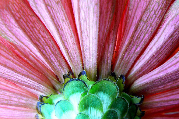
| The backside of a gerbera? Nice! |
|
| Photographer found comment helpful. |
|
|
09/05/2006 07:04:30 PM |
| wonderful image! i love it...nice change in composition! 10 |
|
| Photographer found comment helpful. |
|
|
09/05/2006 12:15:23 PM |
| The lighting on the left side is distracting. |
|
|
|
09/05/2006 08:14:54 AM |
| a little over exposed in the green area, but otherwise nice job - a 6 |
|
| Photographer found comment helpful. |
|
|
09/03/2006 10:55:34 PM |
| Beautiful! One of the more interesting flower pictures I've seen lately. |
|
| Photographer found comment helpful. |
|
|
09/03/2006 04:23:20 PM |
| love the texture in this! |
|
| Photographer found comment helpful. |
|
|
09/02/2006 09:47:51 PM |
| I think this is a very good idea for an abstract. The focus on the petals and the blown spots, particularly in the lower left center (in the green) are both unfortunate in my opinion. I like the way the fan of petals takes up the entire frame. Beautiful symmetry portrayed here. |
|
| Photographer found comment helpful. |
|
|
09/02/2006 04:22:35 PM |
| nice perspective and color. no wow factor but nice to look at. |
|
| Photographer found comment helpful. |
|
|
09/02/2006 09:03:59 AM |
| Nice, sharp rendition, great colors. |
|
| Photographer found comment helpful. |
|
|
09/02/2006 03:53:55 AM |
Composition: 5 - The centering works here, it kind of resembles a hue shifted Macedonian flag!
Technical: 3 - The bottom part seems over exposed, and the rest seems a bit dull, contrast-wise. The also leads to teh colours not having the impact they could. Also, I think you could have easily used the 720 pixels available for this challenge.
Creativity: 3 - Its an unusual crop of a flower, and from underneath, but other than that it doesn't have a lot of creativity.
Appeal: 3
Overall Calculated Average Score: 3 |
|
|
|
09/01/2006 03:16:26 AM |
| Powerfull use of colors... |
|
| Photographer found comment helpful. |
|
|
09/01/2006 01:25:21 AM |
| I just LOVE this.....the colour contrast is so powerful, and the whole photo just has such 'pop'. Only thing is, I wish you'd used your whole size allocation, and made it a bigger photo, and perhaps toned down the highlights to the left of the picture. But very nice....well done. |
|
| Photographer found comment helpful. |
Home -
Challenges -
Community -
League -
Photos -
Cameras -
Lenses -
Learn -
Help -
Terms of Use -
Privacy -
Top ^
DPChallenge, and website content and design, Copyright © 2001-2025 Challenging Technologies, LLC.
All digital photo copyrights belong to the photographers and may not be used without permission.
Current Server Time: 04/08/2025 04:57:50 AM EDT.