| Author | Thread |
|
|
04/22/2008 07:58:02 PM |
|
 Photographer found comment helpful. Photographer found comment helpful. |
|
|
09/07/2006 08:59:54 PM |
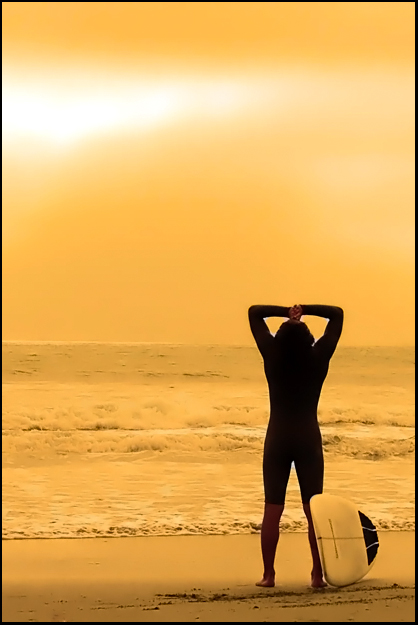
| Good processing, the mood is really nice. Nice composition, too. I guess it's not a bad placing considering the number of entries, heh. |
|
| Photographer found comment helpful. |
|
|
09/07/2006 08:46:07 PM |
| Got a 7 from me,because of it's simplicty and color,well done Shannon for a strong finish in a tough challenge. |
|
| Photographer found comment helpful. |
Comments Made During the Challenge  |
|
|
09/07/2006 07:37:48 PM |
| very intersting colors! 10 |
|
| Photographer found comment helpful. |
|
|
09/07/2006 06:11:29 PM |
| color is too monotone for me, but love the framing |
|
| Photographer found comment helpful. |
|
|
09/07/2006 11:48:46 AM |
| Very nice comp. Some glowing bits around his arms and crotch? |
|
| Photographer found comment helpful. |
|
|
09/07/2006 09:44:15 AM |
| Too little detail in the sea and sky. Nice colors, but that doesn't push it over the edge. |
|
| Photographer found comment helpful. |
|
|
09/06/2006 07:48:00 AM |
| Very good colors, I really love it, nicely done. |
|
|
|
09/05/2006 06:08:11 AM |
| Love the golden hues of the sky but that hue continues down to the ocean color and the sand which gives the image an overall flat appearance. There is no range of tonal hues. The yellow hue of the surf and the ocean just does not look right to the eye at all - there should be some blue tones but there are not. Everything has a yellow cast and as such a normally appealing shot of the sand & surf appears flat and unappealing. I think that if you removed that yellow cast that dominates the scene (either by not using the camera filter or removing the adjustments of color levels that colored the scene) would greatly enhance the appeal of the image. |
|
|
|
09/04/2006 05:19:02 AM |
| Really nice. The warm golden tines and his placement in the shot - GREAT! 8 |
|
| Photographer found comment helpful. |
|
|
09/03/2006 05:35:57 PM |
| Nice comp and colours although there seems to be very little detail in the water. Maybe too much neat image? |
|
| Photographer found comment helpful. |
|
|
09/03/2006 03:06:57 PM |
| A cool shot, and good composition. Not sure if it's due to high contrast, or a flaw in the selections during pp, but in the subjects crotch, and the triangles formed from his arms, the white patches are very prominent and distracting. |
|
| Photographer found comment helpful. |
|
|
09/03/2006 09:52:22 AM |
| Toning here works very well - nice composition, excellent light. |
|
| Photographer found comment helpful. |
|
|
09/03/2006 07:03:37 AM |
| Looks like this was over-sharpened or something. Lots of artifacts along his arms and in the crotch area too. Interesting colour treatment. |
|
| Photographer found comment helpful. |
|
|
09/02/2006 06:06:52 AM |
| Like the color here. good composition too. |
|
| Photographer found comment helpful. |
|
|
09/02/2006 05:06:30 AM |
| Great composition. I like the yellow. Too much Neat Image on the ocean and sand for my taste. |
|
| Photographer found comment helpful. |
|
|
09/01/2006 09:18:36 PM |
A very nice image. I like the subject, color treatment, and composition. You might have cloned out the bright spots around the wetsuit. Your score may get knocked down because of the lack of detail in the sand and water, but I kind of like it. It gives the image a misty/mystical feel.
BTW, been there, done that. Too many times. :D |
|
| Photographer found comment helpful. |
|
|
09/01/2006 05:52:54 PM |
| Love you light in this one. Simply beautiful. |
|
| Photographer found comment helpful. |
|
|
09/01/2006 11:16:51 AM |
| lovely. great use of the rule of thirds. both horizontal AND vertical. works wonderfully. 9 |
|
| Photographer found comment helpful. |
|
|
09/01/2006 10:39:54 AM |
| The color cast is very fitting for this photo and I really like this composition. Well done! |
|
| Photographer found comment helpful. |
|
|
09/01/2006 09:49:43 AM |
| beautiful yellow tones, I do think it could've been a bit more sharper. still I like it :) |
|
| Photographer found comment helpful. |
|
|
09/01/2006 07:22:06 AM |
Composition: 7 - Nicely using the rule of thirds but I find the horizon cutting through the armpits a tad distracting
Technical: 3 - Nice exposure and the colours are suitably warm but the use of NeatImage is way in excess here, obliterating all texture.
Creativity: 5 - Nice shot, and the yellow cast adds some originality.
Appeal: 5
Overall Calculated Average Score: 5 |
|
| Photographer found comment helpful. |
|
|
09/01/2006 06:34:13 AM |
| Don't like the color. do like the pose, composition. 6 |
|
| Photographer found comment helpful. |
|
|
09/01/2006 05:29:50 AM |
|
| Photographer found comment helpful. |
|
|
09/01/2006 03:18:28 AM |
| I LOVE the subject and composition, however I don't like the colors. |
|
| Photographer found comment helpful. |
Home -
Challenges -
Community -
League -
Photos -
Cameras -
Lenses -
Learn -
Help -
Terms of Use -
Privacy -
Top ^
DPChallenge, and website content and design, Copyright © 2001-2025 Challenging Technologies, LLC.
All digital photo copyrights belong to the photographers and may not be used without permission.
Current Server Time: 04/07/2025 01:15:37 AM EDT.