| Author | Thread |
|
|
09/07/2006 10:15:34 AM |
Greets from the Critique Club
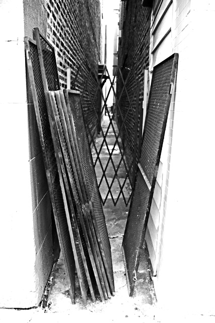
I'm going to have to agree that the overexposed white walls are pretty distracting. I feel this would have been a better entry if it was darker and more eerie or downtrodden in feel to give it more of the emptiness.
Also, I see the alley being the subject in this, but maybe that's just me.
On the good side:
Great contrast and depth. I almost feel as if I am walking into this alleyway.
--Mike |
|
 Photographer found comment helpful. Photographer found comment helpful. |
Comments Made During the Challenge  |
|
|
09/02/2006 11:11:51 AM |
| great V shaped composition, with light in the center and at the edges. love the dark screens/fences, one used, others unused, but all blocking the way. 8 |
|
| Photographer found comment helpful. |
|
|
08/30/2006 06:32:31 PM |
| This is a really neat shot. |
|
| Photographer found comment helpful. |
|
|
08/29/2006 01:49:08 PM |
| creative use of contrast to give depth to an image that may otherwise be just empty alley, now an interesting piece of art. very cool work |
|
| Photographer found comment helpful. |
|
|
08/27/2006 09:22:32 PM |
| The overexposed white walls a the frotn are very distracting so are the metal screens >.< |
|
Home -
Challenges -
Community -
League -
Photos -
Cameras -
Lenses -
Learn -
Help -
Terms of Use -
Privacy -
Top ^
DPChallenge, and website content and design, Copyright © 2001-2025 Challenging Technologies, LLC.
All digital photo copyrights belong to the photographers and may not be used without permission.
Current Server Time: 04/09/2025 01:40:56 PM EDT.