| Author | Thread |
|
|
09/07/2006 08:19:27 AM |
Hello from the Critique Club.
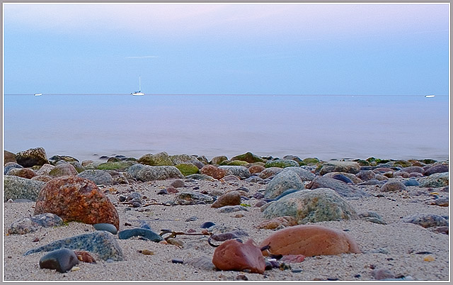
I think you chose a subject for this challenge with a lot of potential. The pastel colors in the background are very effective at keeping the image subject neutral. However, being lighter than the shoreline, my eyes tend to want to rest on the rocks, which is your intent. But the rocks don't have enough punch to them and could be lightened just a bit. I think a little work in post processing with either curves or levels could help balance this image. Once the rocks have more pop, I would suggest that you try a few different crops (less sky, remove the two boats on the ends, or both) and see how the mood of the image changes. You have a good eye for composition and I look forward to seeing more of your entries.
Feel free to PM me if you have any questions regarding this critique.
Tim
|
|
 Photographer found comment helpful. Photographer found comment helpful. |
Comments Made During the Challenge  |
|
|
09/03/2006 01:52:37 PM |
| Nice image! Reminds me somewhat of the way Ansel Adams composed his photos, especially the foreground. I wonder if it would look even more like an Ansel Adams if done in B/W or sepiatone. Hmmmm... |
|
| Photographer found comment helpful. |
|
|
08/28/2006 04:53:17 PM |
| I like the soft, pastel colors of the sea and the sky and the simplicity therein. The rocky shore contrasts nicely with the sea and the sky, but this part of the image seems too grainy, even for sand and rocks. Maybe a little too much sharpening? |
|
| Photographer found comment helpful. |
|
|
08/28/2006 03:19:17 AM |
|
Home -
Challenges -
Community -
League -
Photos -
Cameras -
Lenses -
Learn -
Help -
Terms of Use -
Privacy -
Top ^
DPChallenge, and website content and design, Copyright © 2001-2026 Challenging Technologies, LLC.
All digital photo copyrights belong to the photographers and may not be used without permission.
Current Server Time: 02/01/2026 10:47:13 AM EST.