| Author | Thread |
|
|
11/17/2005 07:05:58 PM |
| oh, i really love this. great job at getting that message across. |
|
 Photographer found comment helpful. Photographer found comment helpful. |
Comments Made During the Challenge  |
|
|
09/23/2003 02:55:36 PM |
| great statement. sad. i feel this way sometimes. . . could be in an ad. |
|
| Photographer found comment helpful. |
|
|
09/19/2003 09:11:02 PM |
| Very creative concept! I like how living blurs into daily tasks here. |
|
| Photographer found comment helpful. |
|
|
09/19/2003 01:31:38 PM |
| Great Photograph, nice Depth of Field. |
|
| Photographer found comment helpful. |
|
|
09/18/2003 11:54:09 AM |
| Very nice! Love the whole concept! |
|
| Photographer found comment helpful. |
|
|
09/18/2003 04:02:26 AM |
| doesn't do much for me sorry ;( worthy of a stock image though ;) |
|
|
|
09/17/2003 07:11:13 PM |
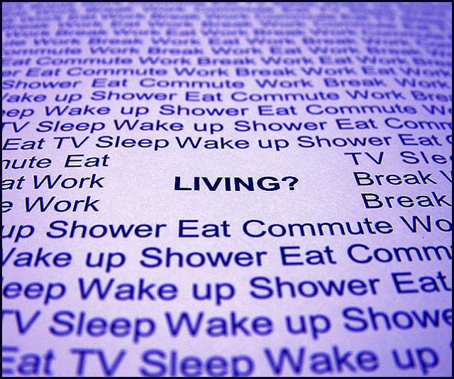
| I hate to be mean, but I've seen this setup on DPC quite a few times now, and it's starting to become pretty unoriginal. The advice seems to be to overexpose a few stops when shooting white paper, so your text stands out better and the contrast is improved. The particular text used for this challenge is a nice touch though. Perhaps you could have used these printed words from a different viewing angle, or doing something different with the paper? I think it's a shame that there's a space around the word 'LIVING?', I'd have prefered the rest of the text right up to it, perhaps 'LIVING?' could have been in another colour. 5 |
|
| Photographer found comment helpful. |
|
|
09/17/2003 04:49:30 PM |
| isn't this a radio commercial? |
|
|
|
09/17/2003 10:33:39 AM |
| Clever. I like it, but I'd just like to point out it's not quite straight in the frame. Like the colour. |
|
| Photographer found comment helpful. |
|
|
09/17/2003 08:45:43 AM |
| I would have just put the word "Life" and titled it "Life is such a blur". I get the message though! |
|
| Photographer found comment helpful. |
Home -
Challenges -
Community -
League -
Photos -
Cameras -
Lenses -
Learn -
Help -
Terms of Use -
Privacy -
Top ^
DPChallenge, and website content and design, Copyright © 2001-2026 Challenging Technologies, LLC.
All digital photo copyrights belong to the photographers and may not be used without permission.
Current Server Time: 02/01/2026 11:42:45 AM EST.