| Author | Thread |
|
|
11/28/2006 12:17:57 PM |
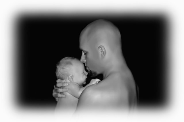
| What a beautiful shot! Just precious!!! |
|
Comments Made During the Challenge  |
|
|
09/07/2006 07:05:20 PM |
| Would have better without the frame. |
|
|
|
09/06/2006 10:47:07 PM |
| This is a very precious shot, but in my opinion, was really hurt by the faded white frame. |
|
|
|
09/06/2006 08:11:44 PM |
| Very moving portrait, looks great in B&W. Should do good here. |
|
|
|
09/05/2006 04:36:47 PM |
|
|
|
09/05/2006 04:23:27 PM |
| i think the border is distracting and would like to see up close on their intereaction |
|
|
|
09/05/2006 09:48:36 AM |
| I don't care for the amount of soft border. |
|
|
|
09/05/2006 05:09:09 AM |
| I think this is a fantastic portrait, but I dislike the fade-to-border. |
|
|
|
09/05/2006 04:06:58 AM |
| Not sure about the vignette. Like the feel of the shot but the vignette distracts and looks too smooth. Needs more texture |
|
|
|
09/04/2006 02:54:25 PM |
| Absolutely wonderful composition and I absolutely love the choice (and execution) of the BW tones. A moment worth saving! However, ahem, the border is IMO, woefully miscalculated. Terribly distracting from what otherwise would have been a memorable portrait. |
|
|
|
09/03/2006 03:49:46 PM |
| very sweet but loosk too neat imaged to me. 5 |
|
|
|
09/03/2006 07:47:31 AM |
| Not fond of the border - it kind of overshadows the picture because it's so thick. Same thing only much narrower might work. The picture itself is very sweet - I like that the son has more hair than the father. |
|
|
|
09/03/2006 04:28:36 AM |
OK..> here we go...I want to be kind, so I will say congrats on the baby...but the photo is not good :-( sorry...
the vignetted frame is terribly distracting and the neat image has made things plastic...I am not sure, but without the frame and a better crop and no neat image, this would have been much better |
|
|
|
09/02/2006 02:07:10 PM |
| The shot itself is nice enough, but yeeeeeeesh... did you really have to do that to the border? |
|
|
|
09/02/2006 11:14:39 AM |
| I find the frame too wide and very distracting from the quiet mood that could be had with father and baby - the central composition is static and fighting for attention with the frame - maybe a vertical presentation or at minimum most of the right side cropped off - is a sweet picture of the two of them but the post processing and composition doesn't do them justice |
|
|
|
09/02/2006 02:29:08 AM |
| I really dont like the feathered frame, it just makes the whole picture seem soft, and draws attention away from the subject, I think cropping to a portrait orientation would have been much more effective |
|
|
|
09/01/2006 04:16:57 PM |
| I bet you are getting hammered for that border... |
|
|
|
09/01/2006 06:32:26 AM |
| Beautiful and touching! Great job! |
|
|
|
09/01/2006 03:09:07 AM |
| a nice compositon and lighting, but the poor focus really brings it down. how are you saving for the web? also, a little too much neat image. |
|
|
|
09/01/2006 02:39:30 AM |
| nice shot but the border is a bit too large and spoils the shot somewhat |
|
|
|
09/01/2006 01:41:28 AM |
|
Home -
Challenges -
Community -
League -
Photos -
Cameras -
Lenses -
Learn -
Help -
Terms of Use -
Privacy -
Top ^
DPChallenge, and website content and design, Copyright © 2001-2025 Challenging Technologies, LLC.
All digital photo copyrights belong to the photographers and may not be used without permission.
Current Server Time: 04/08/2025 05:05:07 AM EDT.