| Author | Thread |
|
|
09/10/2006 08:52:11 PM |
| I like the processing on this shot-- nice work. |
|
 Photographer found comment helpful. Photographer found comment helpful. |
|
|
08/14/2006 09:49:15 AM |
|
| Photographer found comment helpful. |
|
|
08/14/2006 09:10:53 AM |
Thanks for all the helpful comments.
Message edited by author 2006-08-25 23:50:47. |
|
|
|
08/14/2006 07:07:08 AM |
| Nicely done. Love the colors in this picture :o) Good pw also... |
|
| Photographer found comment helpful. |
Comments Made During the Challenge  |
|
|
08/13/2006 09:52:23 PM |
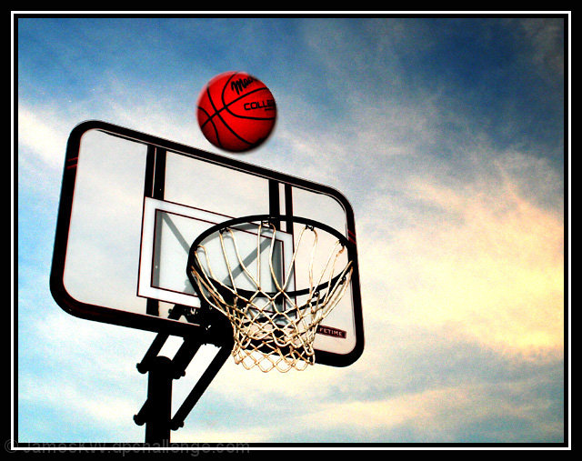
| Border is a bit thick, but the post-processing renders this image interesting, the net is especially compelling. |
|
| Photographer found comment helpful. |
|
|
08/11/2006 05:14:27 PM |
|
| Photographer found comment helpful. |
|
|
08/11/2006 03:15:54 PM |
| obviously, you stopped the motion. however, the post production really takes this image to a different place, somewhere more like digital art than photography. don't get me wrong--i like it--i just don't think this challenge was the best place to show it off. |
|
| Photographer found comment helpful. |
|
|
08/11/2006 02:08:36 PM |
| Nice concept. Still getting a little blur around the ball which is going to probably take some hits in your score as the challenge called for no motion trails, etc... Have some noise going on in here also, especially evident in the sky area. Cool capture nonetheless. ;^) Good luck in the challenge. |
|
| Photographer found comment helpful. |
|
|
08/11/2006 12:52:35 PM |
| I know it is a personal taste but I like the processing. Well done. |
|
| Photographer found comment helpful. |
|
|
08/09/2006 11:41:49 AM |
| love the grain and the red/blue contrast very much, border fits the picture really good |
|
| Photographer found comment helpful. |
|
|
08/09/2006 04:22:40 AM |
| i like the colour treatment in this picture, i think the light grain and the high contrasty feel adds a lot to the overall style. it also draws the eyes direct to the ball, so that seems most effective. unfortunately, it also makes the slight blur to the edge of the ball a bit more obvious, which lets the quality down a little bit. i'm also not that keen on the border; i appreciate that the style kind of emulates that of the board behind the net, but it just seems to fussy here. but, overall, i like this mcuhly. 7. |
|
| Photographer found comment helpful. |
|
|
08/08/2006 12:33:32 PM |
|
| Photographer found comment helpful. |
Home -
Challenges -
Community -
League -
Photos -
Cameras -
Lenses -
Learn -
Help -
Terms of Use -
Privacy -
Top ^
DPChallenge, and website content and design, Copyright © 2001-2026 Challenging Technologies, LLC.
All digital photo copyrights belong to the photographers and may not be used without permission.
Current Server Time: 02/01/2026 07:06:23 AM EST.