| Author | Thread |
|
|
09/19/2003 09:58:16 AM |
There were several lessons learned on this one:
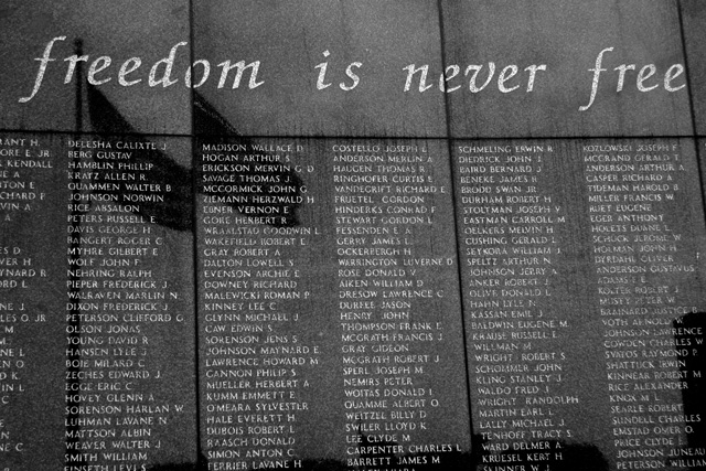
1. Don't change your mind and submit a different image at the last minute. I decided to go with black and white 20 minutes before deadline and then submitted a working draft rather than the final image.
2. Look objectively at an image and evaluate it's impact to other viewers rather than the impact to me during the creation process. You had to be there - just doesn't work with photographs.
3. I've never liked titles on photographs and I'm not good at creating them. From now on the image will need to speak for itself.
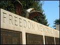
Here is the color alternative that was abandon 20 minutes before the challenge deadline:

It's still not a great image, but probably better than the black and white draft that was submitted. |
|
Comments Made During the Challenge  |
|
|
09/18/2003 07:40:00 PM |
| Good job integrating the reflected flags into the composition -- too bad they weren't a couple of feet farther apart so they'd clear the left column of names. |
|
 Photographer found comment helpful. Photographer found comment helpful. |
|
|
09/18/2003 09:23:51 AM |
|
| Photographer found comment helpful. |
|
|
09/17/2003 06:56:16 PM |
Looking straight at the monument isn't interesting enough. Try getting a different view. Like a side shot would give the piece more interest.
Getting in closer would give you some shadows in the lettering and make the viewer feel the texture of the monument. Some really nice pictures of monuments gets in really close and you can see the rought spot of the stone and makes you almost feel it. |
|
| Photographer found comment helpful. |
|
|
09/12/2003 10:07:31 PM |
I'm making an assumption here that because of the monuments subject that the monument is black. Given this....I think that this woulda been more powerful left in color because hues and colors in the reflections would make it 'blacker'. Focus is a little soft. The title I think in this case detracts from the image. The first thing I thougt while it was loading was 'duh' because the title is right there in the image. I don't usualy detract for title but in this case if it was title"____________________ memorial" I woulda had more feeling for it...
Hope it helps....
TC |
|
| Photographer found comment helpful. |
|
|
09/12/2003 05:21:45 PM |
| This is a nice black and white. I think more of the monument could have been shown. |
|
| Photographer found comment helpful. |
|
|
09/12/2003 04:41:37 PM |
|
| Photographer found comment helpful. |
|
|
09/12/2003 06:51:48 AM |
| A very touching photo! :) |
|
| Photographer found comment helpful. |
Home -
Challenges -
Community -
League -
Photos -
Cameras -
Lenses -
Learn -
Help -
Terms of Use -
Privacy -
Top ^
DPChallenge, and website content and design, Copyright © 2001-2025 Challenging Technologies, LLC.
All digital photo copyrights belong to the photographers and may not be used without permission.
Current Server Time: 04/07/2025 01:03:33 PM EDT.