| Author | Thread |
Comments Made During the Challenge  |
|
|
09/18/2003 07:38:31 AM |
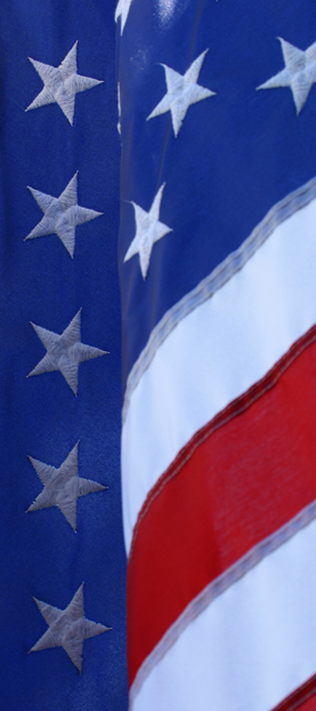
| Interesting composition. I think you need more focus though and the lighting could be better (IHMO bottom left stars need more light)! |
|
|
|
09/17/2003 06:58:26 PM |
| Nice composition. The rich bold colors make the image of the flag pop out. A lot of color also makes it busy. Putting a white frame may make the image pop out even more. Great subject. |
|
|
|
09/16/2003 05:41:27 AM |
| More of a patriotic theme than a freedom theme to the photo. I think the contrasts could be enhanced a little |
|
|
|
09/15/2003 07:56:13 PM |
| I highly disagree, and I think you forgot one key rule when choosing your subject matter, audience. By choosing the american flag you automatically narrow your target audience, as many people do not view the american flag as a symbol of freedom! On the other hand this photo is techniqually (bad spelling, I know) very strong, and depsite my obvious difference to the content, I do like your composition! 7 |
|
|
|
09/15/2003 05:12:35 AM |
|
|
|
09/13/2003 02:35:53 AM |
| Lots of these flags... but does it really stand for freedom???? nice photo though |
|
|
|
09/12/2003 04:04:32 PM |
| Idonno. It's kinda interesting, but it doesn't take my breath away |
|
|
|
09/12/2003 12:24:58 PM |
| nice photo! what a way to show our freedom! God Bless USA! |
|
|
|
09/12/2003 10:32:58 AM |
| Very nice looking composition. I especially like the line of stars running down the left side. Needs some balance adjustments to make the colors stand out more, I think. As it is, the colors are kinda dull/faded looking. |
|
Home -
Challenges -
Community -
League -
Photos -
Cameras -
Lenses -
Learn -
Help -
Terms of Use -
Privacy -
Top ^
DPChallenge, and website content and design, Copyright © 2001-2025 Challenging Technologies, LLC.
All digital photo copyrights belong to the photographers and may not be used without permission.
Current Server Time: 04/09/2025 07:31:42 AM EDT.