| Author | Thread |
|
|
08/14/2006 04:21:17 AM |
Hello from the Critique Club:
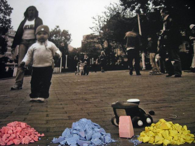
This was a very interesting concept for the Bits and Pieces challenge; however it was a bit risky, as voters could easily think that it wasn't done with basic editing if they didn't take the time to see that it was validated. In general, there are a couple of technical things that would have made this image stronger. First, the wide-angle perspective of the background image makes it look like the horizon isn't level. This could have been fixed prior to printing the image. Second, you might want to reduce the noise in the background image a bit. The noise doesn't match the sharpness of the chalk, which weakens the effect you were trying to achieve. Lastly, the child's toy directly behind the chalk looks like it should have better focus considering how close to the chalk it is located. I'm not sure how difficult it would have been to clone this out before printing but it would have been worth the effort.
Tim |
|
 Photographer found comment helpful. Photographer found comment helpful. |
Comments Made During the Challenge  |
|
|
08/08/2006 07:14:15 AM |
| Good use of "kid" and "kolor." |
|
| Photographer found comment helpful. |
|
|
08/07/2006 10:12:35 PM |
| I like this idea, but would have liked the child a bit more in focus. |
|
| Photographer found comment helpful. |
|
|
08/05/2006 02:32:51 PM |
| I remember the old song...'The primary colors are 1-2-3...red, yellow and blue' . It's a strange edit to me but I guess it works. |
|
| Photographer found comment helpful. |
|
|
08/04/2006 04:19:39 PM |
| I like the concept of this photo. I would like to see a leveling out of the brick walkway as the slope is distracting. |
|
| Photographer found comment helpful. |
|
|
08/03/2006 02:36:03 PM |
Awesome! love the old pic feeling here!
I'm glad to see you got validated |
|
| Photographer found comment helpful. |
|
|
08/03/2006 01:03:58 PM |
|
| Photographer found comment helpful. |
|
|
08/03/2006 12:04:48 PM |
| nice use of color and b/w, i've always liked that effect. |
|
| Photographer found comment helpful. |
|
|
08/02/2006 07:19:19 AM |
| Think this one was basic editing? |
|
| Photographer found comment helpful. |
Home -
Challenges -
Community -
League -
Photos -
Cameras -
Lenses -
Learn -
Help -
Terms of Use -
Privacy -
Top ^
DPChallenge, and website content and design, Copyright © 2001-2025 Challenging Technologies, LLC.
All digital photo copyrights belong to the photographers and may not be used without permission.
Current Server Time: 04/07/2025 01:20:49 AM EDT.