| Author | Thread |
Comments Made During the Challenge  |
|
|
09/16/2003 05:53:33 PM |
The shot for the topic would have been beautiful, but the focus is pretty bad.
It's difficult to see what's actually going on in the background. |
|
 Photographer found comment helpful. Photographer found comment helpful. |
|
|
09/16/2003 04:15:29 AM |
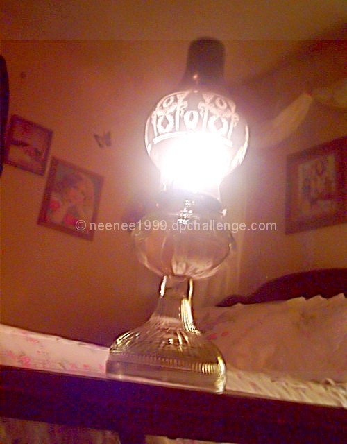
| Not very good focus in this photo, and too much glare from the lamp - a polarizing filter would've helped a lot. |
|
| Photographer found comment helpful. |
|
|
09/16/2003 01:18:41 AM |
| Subject-6,light-2,composition-2,dof-5,contrast-2,3 from me! Lamp is tilted right,you could make it straight and not centered will look much better! |
|
| Photographer found comment helpful. |
|
|
09/15/2003 04:12:12 PM |
| Great idea for the shot. I think it suffers from being centered and off kilter. The light has blown out the whole middle of the shot, but you did get the background in, which would be interesting in itself. Alot of noise there too. This may look real neat, just backlit, without the light on?? |
|
| Photographer found comment helpful. |
|
|
09/13/2003 08:36:15 PM |
|
| Photographer found comment helpful. |
|
|
09/12/2003 07:31:45 PM |
| There is alot of digital noise in the picture and the light is overexposed.... |
|
| Photographer found comment helpful. |
|
|
09/12/2003 01:21:31 PM |
| looks like this shot could've used a tripod, it appears a bit shaky and the focus isn't too clear.. |
|
| Photographer found comment helpful. |
|
|
09/12/2003 03:18:57 AM |
| A bit blurry and noisy and what's up with the blue specs on the edge of the table? I'm also wondering what the light stripe across the top is all about. Is this a capture from a video camera? Nice idea and interesting vantage point, but the tilt doesn't seem enough to be on purpose so it just looks crooked. |
|
| Photographer found comment helpful. |
|
|
09/10/2003 09:40:10 PM |
| Nice idea and composition, I just think the execution could have been better |
|
| Photographer found comment helpful. |
|
|
09/10/2003 12:50:49 PM |
|
| Photographer found comment helpful. |
|
|
09/10/2003 01:53:41 AM |
| seems a bit grainy and the glare from the light is a bit much in my opinion, also seems faded at the top, there seems to be a stripe going across the top of the photo that is very distracting. |
|
| Photographer found comment helpful. |
Home -
Challenges -
Community -
League -
Photos -
Cameras -
Lenses -
Learn -
Help -
Terms of Use -
Privacy -
Top ^
DPChallenge, and website content and design, Copyright © 2001-2026 Challenging Technologies, LLC.
All digital photo copyrights belong to the photographers and may not be used without permission.
Current Server Time: 02/01/2026 12:04:13 PM EST.