| Author | Thread |
|
|
10/23/2006 01:08:44 AM |
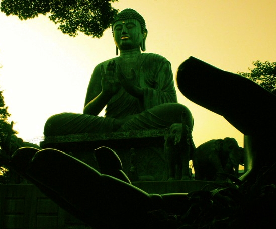
Wow, the silhouette of the elephant and hand in the same photo but with a wild perspective the coloring from one side to the other is remarkable.
This is artwork and what I like to see in a exhibits, so great job on this..
|
|
 Photographer found comment helpful. Photographer found comment helpful. |
|
|
08/09/2006 09:13:15 PM |
Greetings from the Critique Club
Hi Kat,
This is a natural and lovely idea for the challenge. I especially like the way you have captured the statue in the hand of the other one.
Regarding the composition. There are certian elements that are un-Zen-like, and really dp detract from the overall impression that your picture makes. The branch and leaves from near-by trees add a business that is not serene; this is especially the case where the leaves overlap with the statue.
Regarding the post-processing. I\'m not sure the colouring is that peaceful. Niether black nor yellow are particularly soothing colours.
I think (although I\'d have to see the original to be sure) that you lost a lot of detail in your post-processing. It would have been lovely to see more definition on the statue, especially around the hands.
I hope my comments help and Good Luck in future Challenges!
Cheers
Paul |
|
| Photographer found comment helpful. |
Comments Made During the Challenge  |
|
|
08/05/2006 12:55:54 PM |
| Thats pretty cool. I would prefer if it weren't backlit so much and I could see more detail in the hand but the statue looks lovely. |
|
| Photographer found comment helpful. |
|
|
08/04/2006 03:47:45 AM |
| Great job from the 'Great Job Baggie'! I love the foreground in this, it really gives a great sense of depth and relativity to this photo. |
|
| Photographer found comment helpful. |
|
|
08/03/2006 07:59:10 AM |
| Nice idea here, and the colortones work wll. |
|
| Photographer found comment helpful. |
|
|
08/02/2006 12:23:36 AM |
| I like the idea but it seems underexposed in your focus area. And the highlights seem a bit blown out. |
|
| Photographer found comment helpful. |
|
|
08/01/2006 11:03:19 PM |
|
| Photographer found comment helpful. |
|
|
07/31/2006 07:13:17 PM |
| Excellent setting! My only advice would be to simplify the image, it looks a little too cluttered. |
|
| Photographer found comment helpful. |
|
|
07/31/2006 05:42:22 PM |
| I don't like the colouring here, plus I find it a little dark |
|
| Photographer found comment helpful. |
Home -
Challenges -
Community -
League -
Photos -
Cameras -
Lenses -
Learn -
Help -
Terms of Use -
Privacy -
Top ^
DPChallenge, and website content and design, Copyright © 2001-2026 Challenging Technologies, LLC.
All digital photo copyrights belong to the photographers and may not be used without permission.
Current Server Time: 02/01/2026 10:52:55 AM EST.