| Author | Thread |
Comments Made During the Challenge  |
|
|
07/28/2002 10:28:00 AM |
| Dunno what it is but it fits the challenge. |
|
|
|
07/27/2002 01:38:00 AM |
| Very well done for the texture. I can feel the sharp edges... |
|
|
|
07/26/2002 09:55:00 PM |
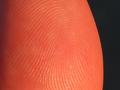
| This image presents texture, but I don't like it that much cuz I don't "get" the context. 4 sjgleah |
|
|
|
07/25/2002 02:18:00 PM |
| I think this would be an awesome background for something that had contrasting texture. If you didn't do that, would framing it so that the lines ran diagonally instead of vertically make a difference? I'm thinking it might give some movement. |
|
|
|
07/25/2002 09:57:00 AM |
| doesnt feel like its in focus |
|
|
|
07/24/2002 11:20:00 PM |
| Texture shows well in this |
|
|
|
07/24/2002 12:46:00 PM |
Composition7
Originality7
Technical Aspects5
Meets Challenge6
Total Score6
For those that are just learning, like me.
Composition: Scoring in this area is based on basic composition of a picture and includes the rule of thirds, balance, cropping, and curved and diagonal lines. Subject matter that does not lend itself to the picture or otherwise unwanted is also considered here.
Originality: Scoring in this area is based on pictures or concepts that I have seen, as well as how much effort you have invested in the picture. Usually a little something that sets it aside from a snapshot. Does it make me want to come back for another look? You know things like that.
Technical Aspects: Focus, exposure, lighting, and other special effects (done by the camera), and post processing are all considered in this category.
Meets Challenge: This is based on my interpretation of if you, have/have not, met the challenge. This is fairly simple but quite important for this site.
There are many sites that can give you assistance in achieving better skills in photography, but I think the best way to learn is to take pictures and show them to other people. Believe me when it is a good one you will know it.
Good luck!
Autool
|
|
|
|
07/23/2002 12:50:00 PM |
| this is a great texture idea, and i like the title, even though i wouldn't want to touch, looks like i would hurt myself. the white strip down the side is good, too, what would've really improved your shot in my opinion is to use the unsharpen mask before posting. i just did this in an editing program and then the texture really popped out at me. -- gr8photos (4) |
|
|
|
07/23/2002 09:43:00 AM |
|
|
|
07/22/2002 10:45:00 PM |
| As a textbook picture of texture, this is great! As a "challenge" pic, it's boring. In my shot, I tried to be more creative with the subject and even added a lil artistic license, while still showing texture. |
|
|
|
07/22/2002 02:50:00 PM |
|
|
|
07/22/2002 11:35:00 AM |
|
|
|
07/22/2002 10:23:00 AM |
| This is definitely texture. My only problem with this image is that it lacks creativity. It's flat... no dimension... no color... no distinct subject... = 4- jmsetzler |
|
|
|
07/22/2002 07:14:00 AM |
| Could use a little more contrast,and looks a bit washed out. |
|
|
|
07/22/2002 06:00:00 AM |
| Good texture, color, photo. Kee |
|
|
|
07/22/2002 02:51:00 AM |
|
Home -
Challenges -
Community -
League -
Photos -
Cameras -
Lenses -
Learn -
Help -
Terms of Use -
Privacy -
Top ^
DPChallenge, and website content and design, Copyright © 2001-2025 Challenging Technologies, LLC.
All digital photo copyrights belong to the photographers and may not be used without permission.
Current Server Time: 04/07/2025 01:26:39 AM EDT.