| Author | Thread |
|
|
08/07/2006 06:21:16 PM |
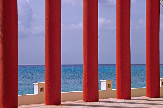
| Undoubtedly voted low for too much red, but this is an awesome composition. I very much like it - this is the type of thing I love to shoot myself. I wouldn't change a thing about the composition - the only nit I have is the color of the sky seems just a tad purplish to me. Very nice shot! |
|
 Photographer found comment helpful. Photographer found comment helpful. |
Comments Made During the Challenge  |
|
|
08/01/2006 04:15:02 PM |
| the red pillars take away from the "blue on blue." |
|
| Photographer found comment helpful. |
|
|
08/01/2006 05:41:30 AM |
| this is a stunning picture, but the red is too distracting for the challege topic. |
|
| Photographer found comment helpful. |
|
|
07/31/2006 04:49:40 PM |
| Well a noticed that there is a teeny bit of destraction like the GIANT RED PILLARS |
|
| Photographer found comment helpful. |
|
|
07/31/2006 09:17:53 AM |
| I am a huge fane a simple yet elegant compositions. I love the red on blue, it is a very nostalgic image to me. |
|
| Photographer found comment helpful. |
|
|
07/30/2006 06:18:52 PM |
| the greenery in the upper right is distracting, i think a slightly different perspective (to align the pillars better) and a different crop would help this shot. |
|
| Photographer found comment helpful. |
|
|
07/30/2006 02:15:16 PM |
| The picture is great with the red pillars popping out at you, but I don't really feel it fits the challenge perfectly. I get what you mean about the blue ocean on the blue sky, but they're both in the background. All in all, this is a nice pic if only for those red pillars. |
|
| Photographer found comment helpful. |
|
|
07/30/2006 11:32:42 AM |
| Very nice contrast in colors and good composition! |
|
| Photographer found comment helpful. |
|
|
07/28/2006 08:25:39 PM |
| You got the poles vertical! That's better than I would have done! I like this, the vertical vs the horizontal works very well. Sky looks a bit unnatural though, especially the clowds look very purple-ish. Only thing I don't like. |
|
| Photographer found comment helpful. |
|
|
07/28/2006 04:29:46 PM |
| Lovely clean red cool Mediterranean perfect columns architecture - keywords for a nice simple photo effect. 9. |
|
| Photographer found comment helpful. |
|
|
07/27/2006 12:18:46 PM |
| This is a very nice picture, but I'm not sure if it actually fits the challenge. |
|
| Photographer found comment helpful. |
|
|
07/27/2006 11:15:29 AM |
| Too much secondary color to hit the challenge theme topic IMO. Other than that it's an interesting composition. |
|
| Photographer found comment helpful. |
|
|
07/26/2006 09:08:50 PM |
| NIce photo, but it's more like Red on Blue... not quite apt for the challenge. |
|
| Photographer found comment helpful. |
|
|
07/26/2006 09:06:08 AM |
| to me this is red on blue not blue on blue |
|
| Photographer found comment helpful. |
|
|
07/26/2006 07:46:35 AM |
Ok I'm lowballing this and here is why. Blue on Blue is what you present as your theme. Yet the dominant subject in the photo are the large red bars. Add to this the white railing or knee wall and the brown bit of concrete showing and this is about as far removed from color on color as could be.
Compositionally, this was a nice idea. As this is advanced editing, I think you could have taken this and played with the colors to get everything up as shades of blue to better meet the challenge. Also would have been good to clone out that piece of hair or whatever is in the top right corner. |
|
| Photographer found comment helpful. |
|
|
07/26/2006 05:10:03 AM |
| THIS IS SOMETHING I WOULD NOT EXPECT. BLUE WATER, BLUE SKY? RED PILLARS? |
|
| Photographer found comment helpful. |
|
|
07/26/2006 04:44:35 AM |
| I think the red is to prominent to be a blue on blue |
|
| Photographer found comment helpful. |
|
|
07/26/2006 02:50:09 AM |
| Really really cool pic!!! |
|
| Photographer found comment helpful. |
|
|
07/26/2006 01:57:07 AM |
| A stretch of mind and details. |
|
| Photographer found comment helpful. |
|
|
07/26/2006 01:32:15 AM |
| Like the contrast, although it does not exactly meet the challenge (same color) |
|
| Photographer found comment helpful. |
Home -
Challenges -
Community -
League -
Photos -
Cameras -
Lenses -
Learn -
Help -
Terms of Use -
Privacy -
Top ^
DPChallenge, and website content and design, Copyright © 2001-2025 Challenging Technologies, LLC.
All digital photo copyrights belong to the photographers and may not be used without permission.
Current Server Time: 04/07/2025 01:13:17 AM EDT.