| Author | Thread |
Comments Made During the Challenge  |
|
|
07/28/2002 09:23:00 AM |
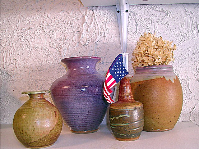
| Lovely portrayal of earth textures. The shelf bracket really bothers me though. And though I love the symbol of our flag, in this image it doesn't seem to work well. It just doesn't flow. I'd like to see more images with these pots though.. Very nice...If it weren't for the mentioned distractions it would be one of my top 10. |
|
|
|
07/27/2002 07:39:00 PM |
| I like most of this picture... the texture, the colors, the lighting, but I wish the mounting bracket from the shelf (above) was not visible. Ya shoulda moved everything over to the left a foot or so... 5 sjgleah |
|
|
|
07/27/2002 11:26:00 AM |
Although there is a lot of texture, the overall photo does not do anything for me. I'm reminded of 'what doesn't belong' sort of thing. I think the Flag is out of place and the bracket for the shelf really takes away from the photo.
ruthann |
|
|
|
07/26/2002 02:29:00 PM |
| Try get the Horizon level and try rearangeing the pots. Also try avoid distracting background elements like the shelf bracket. |
|
|
|
07/26/2002 01:08:00 PM |
The shelf bracket in the background is distracting. Grouped further to the left to eliminate this, minus the flag/or reposition the flag if it is important to you, and make some more dramatic lighting.
I started this challenge with photographing my subject, then went back and reorganized and looked at it differently to come up with my submission. Not saying it was the best in the end, but better than what I started out with.
BTW: Love the pottery!
Email me afterwards? |
|
|
|
07/25/2002 04:21:00 PM |
| This would have worked much better if you'd postioned the vases away from the shelf and support. |
|
|
|
07/25/2002 03:06:00 PM |
| I just wish the shelf wasn't there. Still, above average. |
|
|
|
07/25/2002 01:54:00 PM |
| I think this is a well composed image, but the shelf support and the shelf in the background is just a bit distracting. = 6 - jmsetzler |
|
|
|
07/25/2002 04:28:00 AM |
|
|
|
07/24/2002 12:52:00 PM |
| I see a very nice clean exposure and a good composition with great color and sharpness. I do however think that it needs a slight clockwise rotation. It would also be nice to eliminate the shelf and bracket and cut down on the shadows by using some fill lighting. |
|
|
|
07/24/2002 10:30:00 AM |
| though I really like the flag, I think the picture would have been more effective without it. You have some nicely contrasting textures here, and the colors are complimentary. Also, I think the vases should have been moved to the left some, if possible, to get rid of the wall bracket. karmat |
|
|
|
07/24/2002 08:37:00 AM |
| The flag has the jaggies, try photoshopping harder. The flag is a bit naff too, a limp, sad, round the wrong way thing, and out of context to boot. The picture is slanted down too the left, you need to think about whether the frame is level before snapping away. You have reflections from the flash, turn it off, steady the camera on the back of a chair and use a long exposure. The shelf bracket is intruding, try moving the pots elsewhere, or hide it behind the big pot and frame things lower. The pot arrangement is formal (small big small big) but not formal enough. Try arranging them randomly, or symetrically, or in height order. On the bright side, you didn't just photograph the carpet like some entries this week. |
|
|
|
07/24/2002 05:11:00 AM |
Composition4
Originality7
Technical Aspects4
Meets Challenge7
Total Score6
For those that are just learning, like me.
Composition: Scoring in this area is based on basic composition of a picture and includes the rule of thirds, balance, cropping, and curved and diagonal lines. Subject matter that does not lend itself to the picture or otherwise unwanted is also considered here.
Originality: Scoring in this area is based on pictures or concepts that I have seen, as well as how much effort you have invested in the picture. Usually a little something that sets it aside from a snapshot. Does it make me want to come back for another look? You know things like that.
Technical Aspects: Focus, exposure, lighting, and other special effects (done by the camera), and post processing are all considered in this category.
Meets Challenge: This is based on my interpretation of if you, have/have not, met the challenge. This is fairly simple but quite important for this site.
There are many sites that can give you assistance in achieving better skills in photography, but I think the best way to learn is to take pictures and show them to other people. Believe me when it is a good one you will know it.
Good luck!
Autool
|
|
|
|
07/23/2002 03:07:00 PM |
| The shot itself is fine, good focus/color. As for the challenge aspect, I'm a bit confused, or overwhelmed, take your pick. The wall has GREAT texture, but is obscurred by the vases. The vases have Wonderful texture, in various flavors, but none stand out "as THE subject". The flag sort of implies it is some sort of focal point, but the other vases are more interesting subjects. I gave you a 5. Swash (I really like the wall's texture!) |
|
|
|
07/23/2002 05:26:00 AM |
| I would have like this photo more without the shelf and bracket above the pots, without the flag, and without the flower in the pot. Also, a tighter arrangement of the pots with them overlapping one another. |
|
|
|
07/22/2002 11:06:00 PM |
| good texture in the stucco and the pots. I really like the colors. for some reason, though, I think the shot would have been a lot stronger without the flag in it. also, if you worked with the lighting a little more, you could make this a really terriffic shot. try cutting off all the ambient light, and put a lamp off to the side to create dramatic shadows and accentuate the textures. also, don't use a flash. |
|
|
|
07/22/2002 08:44:00 PM |
| great composition and varied textures |
|
|
|
07/22/2002 11:46:00 AM |
| Love your pots and really love the textured wall. Nice colorful shot. I think your composition could use some help.....maybe a cloth gathered around the bottom of the pots and move them closer together. Nice. Kee |
|
|
|
07/22/2002 07:39:00 AM |
| Nice still-life and composition. |
|
|
|
07/21/2002 09:39:00 PM |
| This would be a GREAT photo if it wasn't leaning to the left and that shelf bracket was not in it. GREAT idea and I do love the textures. Shiiizzzam |
|
|
|
07/21/2002 09:36:00 PM |
| I dont like this one... it seems like it has no preparation at all |
|
Home -
Challenges -
Community -
League -
Photos -
Cameras -
Lenses -
Learn -
Help -
Terms of Use -
Privacy -
Top ^
DPChallenge, and website content and design, Copyright © 2001-2025 Challenging Technologies, LLC.
All digital photo copyrights belong to the photographers and may not be used without permission.
Current Server Time: 04/09/2025 07:35:26 PM EDT.