| Author | Thread |
Comments Made During the Challenge  |
|
|
08/01/2006 05:23:17 AM |
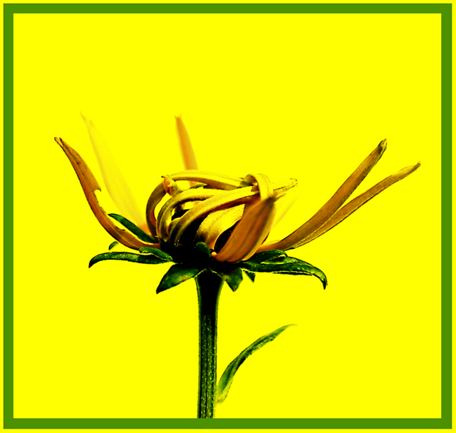
| It's a little too bright...but I like it |
|
 Photographer found comment helpful. Photographer found comment helpful. |
|
|
07/30/2006 11:35:57 AM |
| Interesting plant. Is it real? The contrast is a bit deafening, but I like the contrasting colors. |
|
| Photographer found comment helpful. |
|
|
07/29/2006 11:28:37 AM |
| Unique take on a common subject! Great! :) |
|
| Photographer found comment helpful. |
|
|
07/28/2006 04:33:23 PM |
| I love the look of the flower. I think it might be too contrasty. I don't like the green border, sorry. |
|
| Photographer found comment helpful. |
|
|
07/28/2006 01:09:30 PM |
| Really hard image. Border actually detracts. A bit overprocessed |
|
| Photographer found comment helpful. |
|
|
07/28/2006 11:46:19 AM |
| wow, i love this one. gorgeous. excellent use of the border too. |
|
| Photographer found comment helpful. |
|
|
07/26/2006 08:32:07 PM |
| I don't care for the border at all. A darker shade of green would have worked better, as would a thinner green line, and eliminate the outer yellow edge. However, I like the photograph itself a lot and like the way you processed it, especially the contrast. |
|
| Photographer found comment helpful. |
|
|
07/26/2006 08:24:04 PM |
I like the muted colors of the flower and the "raw" textured effect of the flower. Not the usual super sharp, clean, and vibrant DPC fare.
The border is somewhat distracting though. |
|
| Photographer found comment helpful. |
|
|
07/26/2006 04:42:16 AM |
| Something about the high saturation works for me. I think if I were to change anything, I'd either reduce the width of the green frame, or maybe eliminate it altogether --- maybe use a thin black one?? Love the colors though. Good one. 7 |
|
| Photographer found comment helpful. |
|
|
07/25/2006 10:01:39 PM |
| a little too oversaturated for my taste |
|
| Photographer found comment helpful. |
Home -
Challenges -
Community -
League -
Photos -
Cameras -
Lenses -
Learn -
Help -
Terms of Use -
Privacy -
Top ^
DPChallenge, and website content and design, Copyright © 2001-2025 Challenging Technologies, LLC.
All digital photo copyrights belong to the photographers and may not be used without permission.
Current Server Time: 04/08/2025 08:05:58 AM EDT.