| Author | Thread |
|
|
08/04/2006 10:45:33 PM |
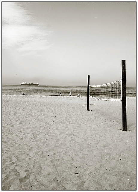
| Definitely has a very soCal feel to it - love the tones you chose, and like the choice of the net with the ocean behind. Nicely composed and exposed. |
|
 Photographer found comment helpful. Photographer found comment helpful. |
|
|
08/01/2006 02:32:49 AM |
Hey jen, I am giving a comment to everyone who gave me one for the beach challenge and your the last one! So I apologize if its not too good, Lol. First thing I noticed was the horizon is abit tilted. i think I may have tried to move the horizon up or down because I knida feel it cuttin the photo in two. I really like the dpeth of field and sepia toning in the photo. Congrats on the fav, now lets go F-stops!!
Joe |
|
| Photographer found comment helpful. |
|
|
07/27/2006 07:32:16 AM |
| one of my top 20 - nice tonality. |
|
| Photographer found comment helpful. |
Comments Made During the Challenge  |
|
|
07/25/2006 02:15:56 PM |
|
| Photographer found comment helpful. |
|
|
07/25/2006 12:57:23 PM |
| Simple, light and nice photo but too much unbalanced empty space. Also compozition cutting photo on halfs by horizont moustly are not recomended. |
|
| Photographer found comment helpful. |
|
|
07/25/2006 12:32:30 PM |
| There are no people playing. Without people you need a stronger element for the picture. |
|
| Photographer found comment helpful. |
|
|
07/25/2006 05:05:14 AM |
| Awesome composition but the horizon is a little off. |
|
| Photographer found comment helpful. |
|
|
07/24/2006 08:18:08 PM |
| I would have cropped in more |
|
| Photographer found comment helpful. |
|
|
07/24/2006 03:36:24 PM |
| horizon is not straight but i like the picture in general |
|
| Photographer found comment helpful. |
|
|
07/23/2006 06:51:15 AM |
| think i would have preferred a little closer.. |
|
| Photographer found comment helpful. |
|
|
07/22/2006 03:25:43 PM |
| Very minimalistic, which I like a lot. |
|
| Photographer found comment helpful. |
|
|
07/22/2006 03:00:00 PM |
| Nice tone to the image and good subject material, but... (1) the horizon isn't straight and (2) I think half the sky could have been cropped out. The image appears too static being divided in the middle and there is more interest in the sand than the plain sky. |
|
| Photographer found comment helpful. |
|
|
07/21/2006 09:09:37 AM |
| great use of b&w. fits the scene well. |
|
| Photographer found comment helpful. |
|
|
07/21/2006 01:48:57 AM |
| I would move the horizon out of the middle of the photo. |
|
| Photographer found comment helpful. |
|
|
07/20/2006 07:31:40 PM |
|
|
|
07/20/2006 06:44:38 PM |
|
| Photographer found comment helpful. |
|
|
07/19/2006 09:47:54 PM |
| I'd prefer a level horizon |
|
| Photographer found comment helpful. |
|
|
07/19/2006 05:24:48 PM |
| i like this. nice clean effective composition well presented |
|
| Photographer found comment helpful. |
|
|
07/19/2006 05:13:58 PM |
| A nice minimalistic photo but I wish your horizon were straight. |
|
| Photographer found comment helpful. |
|
|
07/19/2006 04:23:22 PM |
| Boat looks like it's going downhill...otherwise I like it. |
|
| Photographer found comment helpful. |
|
|
07/19/2006 03:03:27 PM |
| this has a nice simplicity. |
|
| Photographer found comment helpful. |
|
|
07/19/2006 08:20:34 AM |
| The tilted horizon in the distance actually makes me dizzy looking at this. Might have considered strightening it? Nice tones for a B&W, though. |
|
| Photographer found comment helpful. |
Home -
Challenges -
Community -
League -
Photos -
Cameras -
Lenses -
Learn -
Help -
Terms of Use -
Privacy -
Top ^
DPChallenge, and website content and design, Copyright © 2001-2026 Challenging Technologies, LLC.
All digital photo copyrights belong to the photographers and may not be used without permission.
Current Server Time: 02/01/2026 09:23:53 AM EST.