| Author | Thread |
Comments Made During the Challenge  |
|
|
07/25/2006 02:35:40 PM |
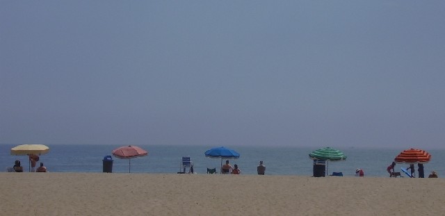
| Great job! The colors do seem to be a bit washed out, needing some processing to saturate it a bit more. Just a bit. I also think that I'd remove the people, and just leave the umbrellas, but that's for advanced editing. The horizon doesn't seem to be very straight in this either, tipping a bit to the right. I do like the shot, and you met the challenge's theme perfectly. I just can't score it as highly as I'd like. |
|
|
|
07/25/2006 10:39:17 AM |
| a little bit on the gray or muddy side. i guess because it was overcast. the subject matter, to me, calls for brighter light. seems sad and dreary. maybe a different title would have changed the comment. |
|
|
|
07/24/2006 11:38:22 PM |
| Very good composition. I think it is a bit flat. Did you try photoshop levels, curves, and hue/saturation? Would make this an excellent photo. 6 |
|
|
|
07/24/2006 04:03:21 PM |
| Contrast low and the horizon not level. The subject does not stand out enough. I wish you well in the challenge. |
|
|
|
07/23/2006 08:04:43 AM |
| Great shot but a little bump in color saturation would have really made this pop |
|
|
|
07/22/2006 03:01:38 PM |
| Great line-up, wish this was brighter. |
|
|
|
07/20/2006 09:16:56 PM |
| interesting composition. 5 umbrellas amybe could have increased the saturation to intensify the colors, Dont you hate the trashcans? |
|
 Photographer found comment helpful. Photographer found comment helpful. |
|
|
07/20/2006 05:28:13 PM |
| I'd like to see this with the colours bumped up a bit |
|
| Photographer found comment helpful. |
|
|
07/19/2006 05:06:33 PM |
| I like the composition, framing. colors are a little flat. 6 |
|
| Photographer found comment helpful. |
|
|
07/19/2006 01:29:05 PM |
| a little dark... but nice |
|
| Photographer found comment helpful. |
|
|
07/19/2006 10:00:33 AM |
| Soft. Sweet, but soft. And you tilted the horizon . . . |
|
| Photographer found comment helpful. |
|
|
07/19/2006 06:02:03 AM |
| Would it be possible to brighten this up just a bit? |
|
| Photographer found comment helpful. |
|
|
07/19/2006 05:54:34 AM |
| perhaps a little bump in contrast may of helped? |
|
| Photographer found comment helpful. |
|
|
07/19/2006 05:06:48 AM |
| Shame you didn't fix the dull colours. This could have been so good. |
|
| Photographer found comment helpful. |
|
|
07/19/2006 02:42:45 AM |
| I like the toned down colors in this shot.... evokes an old fashioned photo. |
|
| Photographer found comment helpful. |
Home -
Challenges -
Community -
League -
Photos -
Cameras -
Lenses -
Learn -
Help -
Terms of Use -
Privacy -
Top ^
DPChallenge, and website content and design, Copyright © 2001-2026 Challenging Technologies, LLC.
All digital photo copyrights belong to the photographers and may not be used without permission.
Current Server Time: 02/01/2026 09:13:11 AM EST.