| Author | Thread |
|
|
02/19/2012 07:55:36 AM |
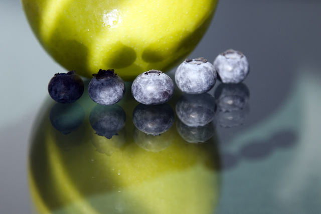
| I like the idea of this one, But the lighting is not right, there should be more even and bright lighting on everything. Either that or a good directional light source, this one has lighting coming from all sorts of different directions. |
|
 Photographer found comment helpful. Photographer found comment helpful. |
|
|
07/30/2006 09:54:09 AM |
Trading Post Comment
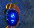
I am afraid I am not a fan of this shot (although I like the quad quite a bit) because the lighting seems a bit blown out on a couple of the blueberries and the focus is not real sharp on the apple. Then there are the white marks on the table (which I assume could have been cleaned off before the shot was taken). I always like your work, but this one looks like something I might have done... ;-P |
|
| Photographer found comment helpful. |
|
|
07/27/2006 05:44:17 AM |
Trading post...
Cute idea, but not one of your better executed ones. You usually have such an eye for the shadows but these seem to have gotten away from you. The reflection is good but the double reflection detracts a bit. I just looked at your notes and the other versions. The colorized versions are beautiful! You should have went with one of them! |
|
| Photographer found comment helpful. |
|
|
07/26/2006 03:01:57 PM |
| I didnt much care for this one Deb. Reading your description I can see that you put thought and time into the setup but at first look it just seemed tossed toegther real quick and a shot taken. The colors didnt jump out and just seem a bit blah (I will look again when I get home as I am on my moms monitor and hers is pretty dark). Looking at the color tweaks I think you may have done better with one of those. The variations even in thumbnail had strong interest to me and the quad view makes for a great picture. |
|
| Photographer found comment helpful. |
|
|
07/24/2006 06:27:25 AM |
| In general, it didn't come off as abstract as some of the other submissions. I gave this a 5. The setup was cute, and I like the different play of shadows on the apple (thanks for the explanation), but in my opinion the crop and the depth of field hurt this image for me. Something more macro may have been called for to meet the challenge, but also to add interest between the contrasting colours, shapes, and textures. I really love the coloured outtakes. I think you should have submitted one of them, because they add a great dimension that is somehow not in your submission, for me. Next time, go for that "stretched brain" shot. :) |
|
| Photographer found comment helpful. |
|
|
07/24/2006 03:04:08 AM |
|
| Photographer found comment helpful. |
|
|
07/23/2006 09:57:08 PM |
I'd personally put this shot above the blue ribbon winner.
Why? It's more abstract.. for one. The blue ribbon is about as abstract as the decimal system.
Your color play is unreal.. and I think the *one* thing that I think you could have done differently was cleaned the mirror better.
A fabulous shot that clearly beats my own submission (which beat you in the standings.. *HUH?!*) by 30,000,000 miles. |
|
| Photographer found comment helpful. |
|
|
07/23/2006 09:40:52 PM |
This one was tough for me. I'll admit I gave it a 4. :( My feeling was this shot was in a grayzone between an abstract and a still life. It didn't know which it wanted to be and thus didn't manage to become either very well.
Technicals are not bad. The blueberries are a bit rough, both blown on the right and in shadow on the left. Also a bit harsh on the apple.
I did like the idea of the reflection. It does make for a nice symmetry (yet the shadows make it asymmetrical, a nice effect). Looking at your outtakes, I like the idea of really messing with the colors. You did some nice stuff there. The yellow/purple or blue/green would have likely gotten a 6 from me and there is a world of difference between a 4 and a 6.
Keep it up. You've been shooting quite well as of late. |
|
| Photographer found comment helpful. |
Comments Made During the Challenge  |
|
|
07/21/2006 10:57:37 AM |
| nice composition. way to crop! 8 |
|
| Photographer found comment helpful. |
|
|
07/19/2006 05:13:17 PM |
| Nice combination of colors and composition. |
|
| Photographer found comment helpful. |
|
|
07/19/2006 08:02:55 AM |
| I love the colors in this one... |
|
| Photographer found comment helpful. |
|
|
07/18/2006 01:30:59 PM |
| Wow!!!! I'm not even normally a fan of abstract photos, but this one is stunning! The lighting, the colors, the excellent abstract composition, and the beautiful sharpness. This is a top pick for me!!! |
|
| Photographer found comment helpful. |
|
|
07/17/2006 06:43:15 PM |
| Very nice. I love the reflections, shadows, everything. |
|
| Photographer found comment helpful. |
|
|
07/17/2006 01:22:29 PM |
| simple and repetative. lighting a little harsh but I like it. 8 |
|
| Photographer found comment helpful. |
Home -
Challenges -
Community -
League -
Photos -
Cameras -
Lenses -
Learn -
Help -
Terms of Use -
Privacy -
Top ^
DPChallenge, and website content and design, Copyright © 2001-2025 Challenging Technologies, LLC.
All digital photo copyrights belong to the photographers and may not be used without permission.
Current Server Time: 04/07/2025 02:23:21 AM EDT.