| Author | Thread |
|
|
07/24/2006 07:53:49 PM |
From the Critique Club:
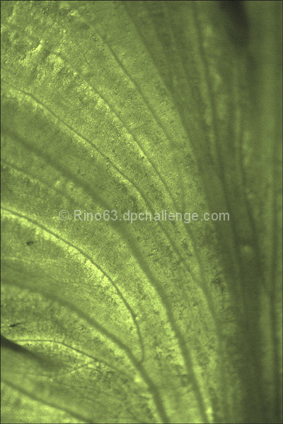
First of all let me preface by saying that abstracts are not my cup of tea. I can appreciate why some like the form, but I'm more of a traditionalist when it comes to the art of photography... That said:
You have some very nice lines here, but overall the shot is very flat. There is nothing there to keep ones attention for any length of time. As has been mentioned by other commentors, playing around in P/P would probably help this out. As an advanced editing challenge you could have done just about anything to the shot. I think the things that would MOST benefit this would be levels or curves (using more of the dynamic range of the shot effectively), boosting contrast (same thing) and boosting saturation (exagerate the tones somewhat). You could also use color balance and the like to actually change some of the tones to come up with something more colorful.
Like Tygerr said before, It's not bad or ugly, it's just not that stunning either.
Yours
TC
|
|
 Photographer found comment helpful. Photographer found comment helpful. |
Comments Made During the Challenge  |
|
|
07/21/2006 04:24:51 PM |
| the color seems pretty flat here - maybe a boost in contrast or saturations would help give it more pop |
|
| Photographer found comment helpful. |
|
|
07/20/2006 01:53:51 AM |
| You might not like what I have to say here, but I think it's too abstract. I know that sounds silly in an abstract challenge, but what I mean is that by shooting it so abstract, all you've really got in the frame is a range of green tones. It would look cool as a tiled wallpaper, but it's just not very interesting as a single image. It's not bad or ugly, it's just not that stunning either. |
|
| Photographer found comment helpful. |
|
|
07/18/2006 02:48:24 PM |
| I think bumping up the contrast here would have really helped...it's a bit flat as is |
|
| Photographer found comment helpful. |
|
|
07/17/2006 06:22:16 PM |
| I think this would be better with a contrasting shape or color. It looks kind of blank. |
|
| Photographer found comment helpful. |
|
|
07/17/2006 08:03:11 AM |
| Very nice. Seems a little soft, would like to see it a bit sharper. But still meets the challenge vey well and I gave it an 8. |
|
| Photographer found comment helpful. |
Home -
Challenges -
Community -
League -
Photos -
Cameras -
Lenses -
Learn -
Help -
Terms of Use -
Privacy -
Top ^
DPChallenge, and website content and design, Copyright © 2001-2025 Challenging Technologies, LLC.
All digital photo copyrights belong to the photographers and may not be used without permission.
Current Server Time: 04/07/2025 01:40:56 PM EDT.