| Author | Thread |
|
|
07/27/2006 03:54:00 PM |
Richard,
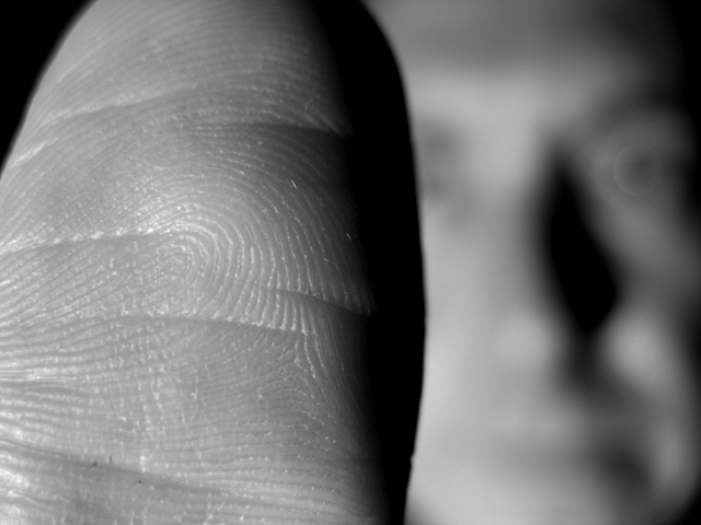
thanks for your comment on my beach entry and I thought I would return the favor. This is a very cool shot and I like your take on lines and the lighting is great. I agree with one of the commentors that the crop on the thumb is too tight. Since it is the main subject I think it would have helped to have the whole thumb in the frame. I thnk I would have given this a six and if your thumb was all the way in a 7 or 8. Its a good shot but the dynamic lines and strange perspective I think held you back from a better score because that isn't what most DPC voters like to see. But I like it! Thanks again for your comment.
Joe |
|
 Photographer found comment helpful. Photographer found comment helpful. |
|
|
07/26/2006 06:10:23 AM |
| love the composition, the juxtaposition of thumb and face. I gave this a 7. |
|
| Photographer found comment helpful. |
Comments Made During the Challenge  |
|
|
07/23/2006 07:08:22 PM |
|
| Photographer found comment helpful. |
|
|
07/20/2006 01:44:13 PM |
| Great idea for this challenge. |
|
| Photographer found comment helpful. |
|
|
07/19/2006 08:10:46 PM |
| Would like left side to be darker. Blurred eyeball on right is distracting. |
|
| Photographer found comment helpful. |
|
|
07/19/2006 01:47:07 PM |
| Clever shot. I like the way the out of focus face in the background provides a context for the thumb image. I just wish you hadn't cropped the thumb so tight - might have been slightly more balanced if the whole thumb was in the frame( with some black space around it). |
|
| Photographer found comment helpful. |
Home -
Challenges -
Community -
League -
Photos -
Cameras -
Lenses -
Learn -
Help -
Terms of Use -
Privacy -
Top ^
DPChallenge, and website content and design, Copyright © 2001-2025 Challenging Technologies, LLC.
All digital photo copyrights belong to the photographers and may not be used without permission.
Current Server Time: 04/07/2025 02:30:27 PM EDT.