| Author | Thread |
Comments Made During the Challenge  |
|
|
07/16/2006 08:53:52 AM |
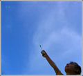
Sorry, but this doesn't convey perspective to me.
But I like the minimalist feel to the picture. |
|
|
|
07/14/2006 06:58:10 AM |
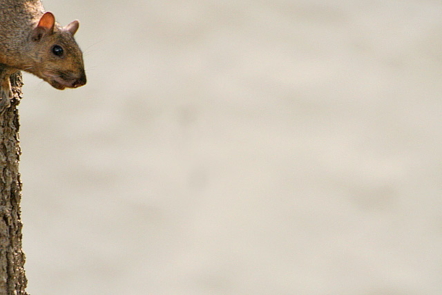
| I like the composition and the negative space, just think you went a little overboard and would have liked to see just a little bit more of the squirrel and tree it´s on, like double the amount that is visible now, then I would have loved the composition. 6 from me. |
|
|
|
07/13/2006 04:41:23 PM |
|
|
|
07/13/2006 11:54:21 AM |
Challenge brief: - Use perspective to create a dramatic effect with your photograph.
Perspective - The appearance of things relative to one another as determined by their distance from the viewer.
For a discussion on perspective check out this article or this one, or for something a bit heavier check out this one. |
|
|
|
07/13/2006 11:12:04 AM |
Meets Challenge: 1/1
Lighting: 1/2
Focus: 1/2
Creativity: 2/2
Aesthetics: 2/3
I like this photo. The lighting is a little flat, and the focus could have been sharper. But the photo is fantastic. I love the placement and composition. Would have received 3 in aesthetics if the backround was a little more contrasty with the subject, but that's more of the environment you were shooting in, so probably nothing you could have changed. |
|
|
|
07/13/2006 05:47:02 AM |
| well, ok, I appreciate what you're going for here...however, we're talking about a shot here with 90-95% negative space...that's just too much...at the very least you probably should have put him/her on the upper left third |
|
|
|
07/12/2006 06:51:18 PM |
|
|
|
07/12/2006 11:35:05 AM |
| Sorry but there is just too much empty space here for me. |
|
|
|
07/12/2006 10:22:46 AM |
| Nice use of negative space. |
|
Home -
Challenges -
Community -
League -
Photos -
Cameras -
Lenses -
Learn -
Help -
Terms of Use -
Privacy -
Top ^
DPChallenge, and website content and design, Copyright © 2001-2025 Challenging Technologies, LLC.
All digital photo copyrights belong to the photographers and may not be used without permission.
Current Server Time: 04/09/2025 03:12:05 PM EDT.