| Author | Thread |
Comments Made During the Challenge  |
|
|
07/18/2006 03:22:27 PM |
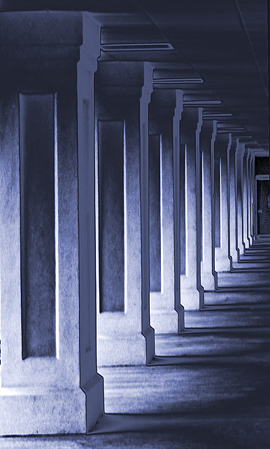
| Your lighting is very interesting. Seems almost like a negative, yet, I don't think it is, at least not completely. The bottoms of the columns look a bit over sharpened. Interesting effect. :) |
|
 Photographer found comment helpful. Photographer found comment helpful. |
|
|
07/18/2006 12:00:12 PM |
| There's a wierd effect that is creating some sort of haze. I think if detail were better preserved I would have like it better. |
|
| Photographer found comment helpful. |
|
|
07/16/2006 06:41:48 PM |
| Technically great shot, to me, but just one thing to break the rigid pattern of the bare minimalism might have made a picture of it. |
|
| Photographer found comment helpful. |
|
|
07/14/2006 02:40:54 AM |
nice perspective
just missing some sharpness |
|
| Photographer found comment helpful. |
|
|
07/13/2006 09:29:11 PM |
| nice tonal quality even though it seems over-enhanced along the ceiling--great composition and potential. |
|
| Photographer found comment helpful. |
|
|
07/13/2006 02:31:37 PM |
|
| Photographer found comment helpful. |
|
|
07/13/2006 06:45:38 AM |
|
| Photographer found comment helpful. |
|
|
07/12/2006 10:13:15 PM |
| Nice diagonals, I like the blue cast and the softness with a hint of texture. |
|
| Photographer found comment helpful. |
Home -
Challenges -
Community -
League -
Photos -
Cameras -
Lenses -
Learn -
Help -
Terms of Use -
Privacy -
Top ^
DPChallenge, and website content and design, Copyright © 2001-2026 Challenging Technologies, LLC.
All digital photo copyrights belong to the photographers and may not be used without permission.
Current Server Time: 02/01/2026 11:25:17 AM EST.